parent
Simplemenu Settings
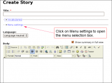
Menu Settings
Menu
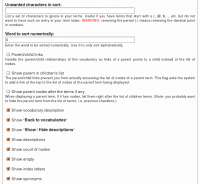
Select the menu to be displayed as the Simplemenu. By default, we display the Navigation Menu which makes the most sense for administrator (as the Simplemenu was primarily created for administrators wanting to quickly go to all administration pages.)
Theme
Select a theme to display your Simplemenu items and dropdowns. The default is called original.
The themes reside in the module sub-folder named themes. Each theme is defined in a specific directory named after the theme. That name is what appears in the dropdown in the settings.
It is possible to add new themes as
Simplemenu Upgrade Path
Version 7.x
Version 7.x-1.x-dev is a starting point... It is not complete, although it shows you a functional Management menu as a dropdown. More to come as time allows... See issue [#791664] for more info.
Version 6.x
Version 6.x-1.13 fixes the vertical menu problem which had to do with CSS caching getting lost.
Version 6.x-1.10 to 6.x-1.12 fixes the non-called theme() function versus the other sub-modules that have callbacks through the theme() calls. However, we really need to have callbacks instead. Added horizontal and vertical themes. Attempts to fix to the vertical menu problem
Simplemenu Inactive Parents
Description
A simple menu is composed of parent menus and children menus. A child has no drop-down menu and a parent does.
By default all the menu items are active, meaning that they all are links one can click on to reach the corresponding destination.
This simplemenu extension allows for turning the link off by replacing the anchor reference in a named anchor. The HTML tag being the same, the simplemenu looks the same, but the item cannot be clicked.
At this time, there is no option to make some of the parent items clickable and others not.
Setup
There is no settings for this module.
Insert Node Parameter: cck (6-1.2)
The CCK parameter let you insert one of your CCK field and some node fields that cannot otherwise be added without being themed.
We support CCK fields and several special field names as follow.
Fields that appeared after version 6-1.2 have a version specified between parenthesis (i.e. 6-1.3).
cck=field_<name>; [requires CCK]
The CCK parameter must be followed by a field name. An empty name is likely to generate an error. The name of a field that does not exist is likely to generate nothing.
For instance, if you have a field named see_also, you would write:
cck=field_see_also;
Parent/Child with Taxonomy VTN
Terms in a taxonomy can be organized as children of other terms. This generates a parent/child organization. For instance, you can have a term Fruit and mark Apple and Peach as children of Fruit.
The parent/child relationship can be used when you organize your Taxonomy VTN to shorten each page of your dictionary. The idea is simple: whenever you enter the top dictionary (taxonomy) page, you only get a list of the root terms (terms that are not children of other terms.) That list gives you access to the children terms and/or nodes of the parent term.
Set Target
If the string f_target is the empty string, then the next actions apply to the main movie.
Otherwise it is the name of a Sprite and the followings actions apply to that Sprite only.
In order to use a dynamic name for the target, use Set Target (dynamic) instead.
Note that this action should not be used since SWF version 5 where you can instead access the movie members (i.e. view Sprites as objects with data members and functions.) For instance, to call the play() function on a Sprite, one can use this code:
  push data 0;
  push data "this";
  get variable;
  push data ...
Get Member
Pop one string or an integer (member name), pop an object reference, define the value of that object member and push the result back on the stack.
Objects include some special members such as:
Declare Function (V7)
Declare a function which can later be called with the Call Function action or Call Method action (when defined as a function member.) The f_function_length1 defines the number of bytes that the function declaration uses after the header (i.e. the size of the actions defined in the function.) All the actions included in this block are part of the function body.
- 1. A function is limited to 65535 bytes.
DefineScalingGrid
This definition is used so the scaling factors applied on an object affects only the center of the object fully. The borders are only affected in one direction and the corners are not scaled (note, restrictions apply, see below.) This is quite useful to draw a scalable button or window.
Fig 1 — Sample button being scaled with a scaling grid


