Made to Order Software Drupal Modules Documentation
The following are different books about our modules and how to best use them.
Please, feel free to comment them so we can improve their content.
Discuss This! (The Module —)
The following documentation is about the Discuss This! module.
The concept of the Discuss This! module is simple:
Let users comment your pages but force them to do so in your Forum.
The module let you add a link at the bottom of your pages, by default called Discuss This!. When clicking that link, it creates a form where one can enter a comment. When that comment is saved, it generates a forum post with the comment attached. That post is then attached to the original page. A page with a post shows you a different link, Participate in this discussion, which let people know that comments have already been posted. It is also possible to display comments under the discussed node.
The following pages explain how one can setup Discuss This! to use all the available features.
Discuss This! User Work Flow
 The Discuss This! module enables you to remove comments from a page, but still let people post comments about it. The page teaser will be used in a forum post and the valuable user comment attached to that forum.
The figure on the right1 shows you the expected process:
- The user comes to your website.
- Situation Assessment:
- The user can post and the page does not yet have a discussion, show the "Discuss This!" link2
- The user can post and the page already has a discussion, show the "Participate" link3
- The user must log in, show a message asking the user to log in first
- If the user must log in and can register an account4, show a message asking the user to log in or register an account first5
- From the "Discuss This!" link, the user is sent to a Discuss This! comment form6
- When saving a comment, Discuss This! may create the forum topic7 if it did not exist yet
- From the "Participate" link, the user is directly sent to the forum where one can read existing comments and then post a comment as usual
- 1. Click the figure to enlarge it.
- 2. The text of the link can be set by the administrator.
- 3. On top of the link, when the page has an existing discussion, a few of the latest comments can be displayed after the links.
- 4. We offer the user to register an account when it is possible to do so without direct administrative intervention.
- 5. IMPORTANT: When a registration is required, the user loses the reference to the page (shown as the red arrow in the figure.)
- 6. The Discuss This! module has its own comment form to avoid creating a forum topic before we are sure a comment will indeed be submitted. This is crucial to avoid spam by bots that ignore the nofollow hints.
- 7. When the creation of the forum fails, the user is likely sent to your home page by Drupal Core. This happens when you have modules that add required fields that are not filled with default on initialization.
Discuss This! module Known Issues
The module works and is secure, however, there are problems difficult to circumvent. The following lists them. If you can help fixing some them, you'll be more than welcome!
Reordering the Comments on your Node
It is possible to reorder the node fields using the CCK module. If the Discuss This! comments do not appear exactly where you'd expect them to be, try using the the CCK module:
- Download the CCK module
- Install the CCK module
- Go to Administer » Content management » Content types
- Click on Manage content fields next to the node type you are trying to re-organize
- Using the cross on the left (+) move the fields in the order you would like to see them appear
- Click on Save
- Check that it worked
This trick generally works to place fields within a node. It will not work to move blocks around. If you want to place the Discuss This! comments after a block, then you have to create a block with Views or another similar technique.
Recent Comments on Original Node
Settings
The module now offers the option to display the recent comments on the node being discussed.
You may have to play with the permission to finally see the comments (i.e. comments may need to be shown to anonymous users.)
Drupal issue: Displaying recent comments and Login/Register link for Anonymous users
Known conflicts
There is a known conflict with Comments Bonus API which is required by the AJAX Comments module.
Modules with Required Fields
It happens that you install a module with one or more required fields. In most cases, modules provide a set of default values that will suffice to permit Discuss This! to create new nodes automatically (it needs to do so whenever a new topic is required.)
A module known to generate that side effect is the Domain module, used to enable multiple domains and sub-domains to represent your website.
At this time I did not look closely to find a way to circumvent this issue. I think that we could have a default page shown to the administrator who can then save a page with defaults. Later, we'd reuse those defaults to create pages automatically.
Comment Approval
At this time there is no queue mechanism for the very first comment. The module would need to save the comment in the standard comment queue. Unfortunately, there won't be a topic yet, thus saving the comment is not possible in the queue provided in Drupal Core.
There are two solutions available:
- We manage our own Discuss This! queue
- We save the message as if it was posted on the node being discussed
Solution 1 is a problem because it requires rewriting all the code necessary to manage such a queue.
Solution 2 has another issue: Drupal administrators may want to offer both types of commenting (i.e. comments on nodes and Discuss This!) in which case we cannot know what to do with those comments1.
Registration Process
By default, whenever you register an account on a Drupal website, you access multiple pages. This means you lose the ?destination=page-to-comment query information.
There are several solutions here:
- Change the work-flow so log in and registration are put after the comment is posted
- Change the query into a cookie that generates a box at the top of the pages once the user is logged in
Of course, having an implementation with both solutions would be perfect. Then we can let administrators choose what best fits their website. (i.e. solution 1. could be a problem in a mostly private website.)
CAPTCHA
This module is handled internally by removing the effect of the CAPTCHA on the forum post being created. Since you can add a CAPTCHA to the Discuss This! form used to enter a new comment, it does not matter that the CAPTCHA of the forum post be bypassed.
Boost Module
At this time, I implemented two Boost cache clearance. One is when you create the very first comment and the other is when you edit the post.
However, when a user adds a new comment, the node being discussed will not be refreshed until the expected Boost delay for that page.
- 1. We probably can add a field in the comment table to indicate that the comment came from the Discuss This! module and needs to be manage as such.
Drupal Aggregator
The default Aggregator Drupal module does not work very well. There are several problems with the Drupal Core module, one of which we have not fixed in our version (i.e. the flatness of the item table.)
There is a list of the known issues and our comments and whether we fixed the problem:
| Problem | Solution in m2osw's version of Aggregator |
|---|---|
| Missing XML marker | The <?xml ... ?> marker is missing from some RSS feeds, add it as required |
| Spurious data | Some RSS feeds add spurious data before or after the <?xml ... ?> or the closing tag </rss> (the only valid thing after the closing root tag are comments.) |
| XML Stylesheet | The XML parser used does not like XML stylesheets; we remove them before parsing. |
| XML entities | RSS feeds include all sorts of characters that are not valid UTF-8 characters. We attempt to fix all those that we can fix. Most often we find the Windows 1252 apostrophe and different types of quotes. |
| Lone Ampersand | It is frequent to find a lone ampersand, instead of &. We fix those so the output becomes a valid &. |
| Date timezone | If we find "UT" instead of "UTC" in a date, change it. This happens and would completely fail parsing of the date. |
| Empty XML files | Some RSS feeds return an empty file instead of nothing when there was no additions since last check. |
| Large number of Blocks | In Core, each RSS feed added to the Aggregator adds a corresponding block. With this version, you must turn on a flag or the block is not made available, making the list of blocks a lot shorter if you have a really large number of RSS feeds. |
| Open in the same window | By default, the Core Drupal aggregator creates links that open all the destinations in the same window. Our version opens the links in a new window, meaning that your website stays open when your users visit that destination link. |
| Lack of logs | We enhanced the log capability by adding some watchdog() calls and also adding parameters so you know the name of the RSS feed that generated problems. |
| Limit the GUID | The database limits the item GUID to 255 characters: VARCHAR(255). We clamp that parameter to make sure we don't get an error (MySQL auto-clamps.) Although this could cause problems with duplicates, it doesn't seem to ever happen. |
| Limit author and title fields | Like the GUID, the author and title fields are limited to 255 characters. These two fields are clamped when saved in the database. |
| Deleting old items | Somehow, the Core Aggregator module doesn't properly get rid of older items. We palliate to that problem by adding a loop over all the existing items. This can be slow the first time if you already have many items in your database. Afterward, it should not be that bad since it only deletes the few old items. |
| Hidden feed identifier | With Core, the feed identifier can only be known by editing the feed. It is at times practical to know the identifier (i.e. to use it in insert_view) without having to click on edit or at least look at the edit link in your status bar. We added an ID column. |
| Default update time | The default update time is set to 1h which seems extremely frequent to us. Most RSS feeds do not get updated more than once a day (when not once a week!) So by default we set the update time to 1 day. |
| Never delete items | Support the concept of never deleting anything from your site. Although this is not recommended (it grows real fast to a size that makes your site slowdown...) it works. Choose the option "Never" in the Delete every feature. |
We also added support for transforming RSS items into nodes. There are many features in that regard. This is done at the time RSS items are retrieved, and for sites that already had many items, it can be applied to existing items via CRON.
Finally, we included an attempt in using Taxonomies instead of the usual Categories (only in the nodes created by the module.) At this time, the taxonomy items must be name the same as the aggregator categories.
You can download our version by clicking on the tarball below.
IMPORTANT NOTES
If you find any problem, don't hesitate to post a comment below, email us, or register and post a ticket. Thank you.
You can also have a look at Drupal issue #350667.
| Attachment | Size |
|---|---|
| aggregator-6.20-m2osw-1.1.tar_.gz | 23.19 KB |
| aggregator-6.20-m2osw-1.0.tar_.gz | 23.12 KB |
How do I create a menu entry with Drupal?
 Pages and menus are separate modules in Drupal.
Yet, menus are smart enough to know when a page is attached to menu item. So when you edit a page, it shows you that menu item. This item is shown in the Menu settings box. In most cases, that box appears before the Body of your page1. The box will already be open if the page is attached to a menu. By default, when you create a new page, it will be closed since it is not attached to anything yet.
To create a menu item, you can either do so when you edit your page (easiest) or add a menu using the administration menu and going to Site building » Menus » <menu to be edited>. In the first case, the menu will automatically be attached to your page. In the second case, you have to remember the exact path to your new page to be able to add the menu entry. Note that using the menu administration is required if you want to create a menu entry to a place that is not a page (i.e. a View such as a list of testimonials, etc.)
") The figure at the top left (click to enlarge) shows you an empty page when you select Create content. As you can see, the Menu settings are closed then. To enter the necessary information, click on that title which opens, and type in a menu label (see the figure to the right of this paragraph.) Most of the time, the other information does not need to be modified. Just in case you created a different menu or wanted to use the Secondary menu, the drop down let you select that other menu. Actually, you can even create sub-menu items by selecting an existing sub-item as the parent of the new menu item. This is not always practical, unless you are using a drop down menu or a DHTML menu (our menu on the left side of this page is a DHTML menu organized with multiple levels of menus. We also offer a module called Cute Menu that shows a one level drop-down menu.)
The figure at the top left (click to enlarge) shows you an empty page when you select Create content. As you can see, the Menu settings are closed then. To enter the necessary information, click on that title which opens, and type in a menu label (see the figure to the right of this paragraph.) Most of the time, the other information does not need to be modified. Just in case you created a different menu or wanted to use the Secondary menu, the drop down let you select that other menu. Actually, you can even create sub-menu items by selecting an existing sub-item as the parent of the new menu item. This is not always practical, unless you are using a drop down menu or a DHTML menu (our menu on the left side of this page is a DHTML menu organized with multiple levels of menus. We also offer a module called Cute Menu that shows a one level drop-down menu.)
Once you save your new page, the new menu item will appear in your menu. At this point, you may have two problems: you may not see it in the menu where you wanted to add it... it may not appear at the right location (it should be the last item, before this item or after that item...)
If it is not in the correct menu, edit your page and use the Drop-down to select the correct parent menu. For this procedure, the administration screen is not any more practical.
If it does not appear at the right location, then the weight is incorrect. You can try changing the weight manually, or you can go to the menu administration screen (Site building » Menus » <menu to be edited>) and drag and drop the menu item(s) in place which is a lot easier.
By default, menu items will be sorted alphabetically. However, once you started moving them around in the administration screen, they all get a weight. From that point on, you will pretty much always have to do to the administration screen to properly order your items. You can fix that problem on a per section basis by editing all the items and reseting their weight back to 0. Infortunately, it will not stick if you want to again move other items around.
Note that for fast access to your menu administration, you can bookmark them in your browser. Don't share that bookmark with others, unless you give them authorization to deal with your menus. Otherwise, they will just get an access denied error.
- 1. The one exception we know of is the Product and Product kit pages where the menus appear way below, probably because in many cases you would not want to add a product directly in a menu.
InsertNode (The module —)
The following pages are the official documentation of the InsertNode module available on Drupal.
This module is a filter used to insert a node in another. Version 5.x is only being maintained. Version 6.x still evolves as time passes. It is already pretty powerful!
Since this is a filter, you can use it to insert a node in any text area that supports filters by including the InsertNode filter in it.
It works by using the simple syntax:
[node:<node name or nid or *1> <parameters>]
The following describes all the available parameters and how to use all the neat features of this module.
- 1. The asterisk can be used to reference the current node.
InsertNode Compatibility (D5/D6)
Version 6.x added many new features (parameters, themes, etc.) to the module. However, the tags themselves remain backward compatible except for those two parameters:
- collapsible
- collapsed
The D5 version will insert the node content and make it collapsible or collapsed.
The D6 version inserts nothing on these parameters. It only makes the result collapsible or collapsed.
So if you are using D5 and want to keep the collapsible and collapsed look the same, you must add the body keyword as in:
[node:123 body collapsible]
[node:123 body collapsed]
InsertNode Installation
Decompress the module in your sites/all/modules folder.
Go to admin/build/modules (Admin » Site Building » Modules) and select the new module (under package named "Filters input".)
Go to admin/settings/filters (Admin » Site Configuration » Input formats) and select the Insert node filter1.
Make sure that the text areas using the [node:...] tag make use of one of the formats having this Insert node filter turned on. The Input format field set shows [node:123 parameters] for any format that supports the Insert node filter.
You are ready!
- 1. It is suggested that you create a new format if you are to use this filter only on a few pages. This way, you avoid wasting time on all pages.
Insert Node Usage
Syntax
The Insert node tag syntax is:
[node:<name of node> <parameters>]Name of node
The <name of node> can either be
- The name of the node, i.e. it's URL without the protocol and domain1, or
- The node identifier (the number you see in your URL when you edit the node), or
- An asterisk (*) in which case the current node applies2 (6-1.2).
As pointed out by one of our users, the asterisk can be used to create macros.
Parameters
All the <parameters> are optional. Since version 6-1.1, some parameters accept a value (i.e. cck, link, more, etc.) This is defined as:
<parameter>=<value>;3
It is expected that each parameter is used at most once. However, it is valid to specify the same parameter twice (as in "title body title" to include the title before and after the body.) For some parameters (i.e. collapsed, demote, etc.), only the last instance is taken in account.
By default, not including any parameters that add content is similar to using content (see below.) However, the default uses a separate theme and therefore it can be made different by overloading the theme named InsertNode_default.
In Drupal 5, you can only specify one parameter. And the collapsible option automatically includes the body.
In itself, the order of the parameters is not important. However, in most cases it defines the order in which you want the data to be displayed. So if you want the title, teaser and more link in that order, you must enter them in that order as in:
[node:article41 title teaser more]
Final Output
Once the output was generated, it is themed one last time using the InsertNode_node theme.
The default InsertNode_node theme adds one more <span> or <div> around the output and includes three classes:
- insert-node
- insert-node<count>
- insert-nid<node-nid>
These classes can be used to create advanced CSS output specific to a node or an entry insert on another page.
A <span> is used if the Insert Node inserts only <span> or no tags. Otherwise, a <div> is used.
NOTE
The version defined between parenthesis in the list below shows the time when the given parameter appeared. Parameters that were available in 5-1.0 are still available in 6-1.2, for instance. When a parameter changed in some way, it is indicated in its definition.
The parameters that are marked as [no content] do not insert any content and thus do not affect the insertion of the "default" data. In other words, if you only used parameters that are marked [no content], you will get the "default".
- 1. For instance, to insert this very node, I would use the name doc_insert_node_usage.
- 2. The asterisk is useful to repeat something from the node in a block. This could be the title of the node or a CCK field. I would suggest you avoid using the body of the current node in a block!
- 3. It is important to note that the value ends with a semi-colon and it cannot itself include a semi-colon.
Insert Node Parameter: "default" [no content parameter] (5-1.x)
By default, the node tag can be used without any of the parameters that add content (the parameters without the [no content] comment in their description title.) In that case, the content of the node is inserted as if content had been specified.
However, since version 6-1.1, the theme of the default parameter can be overloaded. This means you can change the default by writing a function to overload the default.
CSS Class: div.insert-node-content
Theme: InsertNode_default
Insert Node Parameter: body (5-1.x)
Display the body of the node, the terms and the CCK fields. Input filters are applied.
CSS Class: div.insert-node-body
Theme: InsertNode_body
See Also: Insert Node Parameter: content (6-1.0), Insert Node Parameter: page (6-1.2), Insert Node Parameter: teaser (5-1.x), Insert Node Parameter: themed (6-1.0)
Insert Node Parameter: booktree (6-1.2)
If you have books and you are using the booktree module, then you can insert a book tree in another node using the Insert node module with the booktree parameter.
The book tree will start with the specified node.
See Also: Insert Node Parameter: cck (6-1.2)
IMPORTANT NOTE
This parameter is an extension that should be part of the booktree module and not of the Insert Node. It made not be supported in future versions (3.x, D7...)
The Insert Node module verifies that the user has permission to view that book tree. If not, nothing is output which means that the tag may instead generate the "default" output.
Insert Node Parameter: cck (6-1.2)
The CCK parameter let you insert one of your CCK field and some node fields that cannot otherwise be added without being themed.
We support CCK fields and several special field names as follow.
Fields that appeared after version 6-1.2 have a version specified between parenthesis (i.e. 6-1.3).
cck=field_<name>; [requires CCK]
The CCK parameter must be followed by a field name. An empty name is likely to generate an error. The name of a field that does not exist is likely to generate nothing.
For instance, if you have a field named see_also, you would write:
cck=field_see_also;
See Also: Insert Node Parameter: cckteaser (6-1.3)
cck=body;
This inserts the body data as is (without being themed). The body data is still parsed through all the input filters.
Note that in case of a book, only the description of the book will appear with this option. To get the navigation, use the book_navigation field.
See Also: Insert Node Parameter: body (5-1.x)
cck=book_children; (6-1.3) [requires book]
A book page includes a navigation panel that include a list of children (sub-pages) and a set of three links at the bottom (previous, parent, and next.) This field can be used to only show the children of that book page.
See Also: Insert Node Parameter: booktree (6-1.2)
cck=book_navigation; (6-1.3) [requires book]
A book page has a description, which is the regular body of the page, and a navigation. The navigation is composed of a list of children and a set of links: previous, parent, and next. This option extracts that portion of a book page.
See Also: Insert Node Parameter: booktree (6-1.2)
cck=teaser;
This inserts the teaser data. Like the cck=body; parameter, it is parsed through all the input filters, but not themed.
See Also: Insert Node Parameter: teaser (5-1.x)
cck=title; (6-1.3)
This inserts the title without any decoration (H2 tag, for instance.) The title is passed through the check_plain() function replacing any character that would otherwise generate a problem to your HTML (i.e. < is transformed into <, etc.)
See Also: Insert Node Parameter: title (6-1.1)
cck=webform; (6-1.3) [requires webform 2.x+]
This option inserts the form of a webform node. When inserting the body of a webform everything is included (i.e. description, terms, links...)
See Also: Insert Node Parameter: webform (6-1.3)
IMPORTANT NOTE
Note that the parameter value ends with a semi-colon! Do not include quotes unless you want to see them in the output. Yes. This means the text cannot include a semi-colon as is. Since CCK field names should not include semi-colon, you should have no problem.
Many of the special fields, such as the cck=body; and cck=teaser; always work. Some of the fields, however, require a module or another, such as the CCK module, to be installed. When a CCK field is used without the CCK module installed, the Insert Node module output an inline error letting you know that you need to install and enable the CCK module.
Insert Node Parameter: cckteaser (6-1.3)
The CCK parameter let you insert one of your CCK field in full. This parameter, cckteaser, let you insert the teaser of your CCK field.
This feature uses the teaser flag of the CCK module in order to insert the teaser data. This means only the field_<name> fields make the distinction between cck=... and cckteaser=..., the other fields simply ignores the difference.
For more information on the CCK field names that are supported, check the Insert Node Parameter: cck (6-1.2) page.
IMPORTANT NOTE
Note that the parameter value ends with a semi-colon! Do not include quotes unless you want to see them in the output. Yes. This means the text cannot include a semi-colon as is. Since CCK field names should not include semi-colon, you should have no problem.
This option requires the CCK module to be installed. When it is used without the CCK module installed, the Insert Node module output an inline error letting you know that you need to install and enable the CCK module.
Insert Node Parameter: collapsed (6-1.0) [no content]
Put the generated content inside a collapsible frame.
The frame is collapsed at the start.
By default, the title of the node is used as the title of the frame. You can specify (since 6-1.2) the title as the value of the parameter:
collapsed=There is my other node, click to read it;
See Also: Insert Node Parameter: collapsible (5-1.x) [no content]
IMPORTANT NOTE
Note that the parameter value ends with a semi-colon! Do not include quotes unless you want to see them in the output. Yes. This means the text cannot include a semi-colon as is.
Insert Node Parameter: collapsible (5-1.x) [no content]
Put the generated content inside a collapsible frame.
The frame is expanded at the start.
By default, the title of the node is used as the title of the frame. You can specify (since 6-1.2) the title as the value of the parameter:
collapsible=There is my other node;
See Also: Insert Node Parameter: collapsed (6-1.0) [no content]
WARNING
The version of the module for Drupal 5.x outputs the body whenever the collapsible parameter is used.
IMPORTANT NOTE
Note that the parameter value ends with a semi-colon! Do not include quotes unless you want to see them in the output. Yes. This means the text cannot include a semi-colon as is.
Insert Node Parameter: comments (6-1.1) [no content]
Attach the comments at the bottom of the node data.
The comments will be shown just as in the regular page (i.e. flat, thread, expanded, collapsed.)
Note that this data is considered a [no content] because it does not affect the use of the "default" parameter. However, it definitively adds content to your output.
CSS Class: div.insert-node-comments
Theme: InsertNode_comments
IMPORTANT NOTES
The comments are appended to anything else that you have inserted. You cannot use the order of your parameters to put the comments in a different location. In order to do that, use multiple node tags.
Specifying comments multiple times will insert the same comments multiple times.
If the comments module is not installed and enabled, this parameter adds an inline error letting you know that the comments module is not currently available. Either enable the module or remove the comments parameter.
Insert Node Parameter: content (6-1.0)
Display the body of the node, the terms, the CCK fields, and the links. Input filters are applied.
When no output parameter is used, this is what appears by default. However, the "default" theme can be changed.
CSS Class: div.insert-node-content
Theme: InsertNode_content
See Also: Insert Node Parameter: body (5-1.x)
Insert Node Parameter: created (6-1.0)
This parameter inserts the date when the specified node was created.
The date format defined for the site is used to display the date (see the Drupal function named format_date().)
CSS Class: span.insert-node-date
Theme: InsertNode_created
See Also: Insert Node Parameter: modified (6-1.0)
Insert Node Parameter: demote (6-1.2) [no content]
Demote (positive) or promote (negative) the headers found in the output before inserting it into your node.
This is useful if you want to include a complete node that has an H1 title, H2 sub-titles, etc. and make these sub-titles of your current page, maybe starting at H3 (i.e. using "... demote=2; ..." in your tag.)
By default, the value of this parameter is expected to be 1. To change the value use the following syntax:
demote=<integer>;
The integer can be negative, in which case it promotes the headers (i.e. H3 can be changed to H1 using "... demote=-2; ...")
This parameter, by itself, does not generate any output.
IMPORTANT NOTES
Note that the parameter value ends with a semi-colon! Only integers, eventually negative, are accepted in this parameter. An invalid integer will be transformed into the 0 or 1. Note that the value 0 has no effect.
Only the last demote parameter is taken in account.
Insert Node Parameter: edit (6-1.2)
This parameter adds a quick link to edit the node1.
CSS Class: span.insert-node-edit
Theme: InsertNode_edit
See Also: Insert Node Parameter: link (5-1.0)
- 1. It may appear even to users who do not have edit permission (which is a bug,) although it still won't allow them to edit anything.
Insert Node Parameter: imagefield or imagecache (6-1.3)
The imagefield parameter allows you to insert a CCK image from the specified node.
The parameter must be set to a very specific value for the feature to function properly. The following describes the value:
imagefield=<field name>:<image cache value>:<type>:<index>
The <field name> is the name of the CCK field. You need to include field_ as the introducer. For example, a field you named image is referenced as field_image.
The <image cache value> represents the way the image is displayed. Most often it represents a size such as small, medium, and large.
The <type> tells the system how to generate the HTML. The Insert Node module supports two types:
- default — show the image as is
- link — show the image with the link specified in the CCK field
The <index> returns that image from the CCK array. The default is zero (0) meaning that the very first image is returned. If you are not using a multi-image CCK field (i.e. limited to 1,) then you can ignore this field entirely.
An example to display the large image of you third photo field with the link:
imagefield=field_photo:large:link:2
Notice that the third photo is #2 since the counter starts at 0.
Insert Node Parameter: link (5-1.0)
Display the title of the node as a link to the node, unthemed.
With version 6.x-1.1, it is possible to change the link to a text that you specify as in:
link=Read more about that in yesterday's post!;
CSS Class: span.insert-node-link
Theme: InsertNode_link
See Also: Insert Node Parameter: edit (6-1.2), Insert Node Parameter: more (6-1.1)
IMPORTANT NOTE
Note that the parameter value ends with a semi-colon! Do not include quotes unless you want to see them in the output. Yes. This means the text cannot include a semi-colon as is.
Insert Node Parameter: modified (6-1.0)
This parameter inserts the date when the node was last modified.
Note that a node that was never edited does not have a modification date. When that happens, the creation date is used instead.
The date is formatted using the default format date function (see the Drupal format_date() function.)
CSS Class: span.insert-node-date
Theme: InsertNode_modified
See Also: Insert Node Parameter: created (6-1.0)
Insert Node Parameter: more (6-1.1)
Display the words "Read more..." with a link to the node, unthemed.
Useful when just the teaser or the title are being shown.
The text "Read more..." can be changed by specifying a string after the parameter like this:
more=Lire la suite...;
CSS Class: span.insert-node-more
Theme: InsertNode_more
See Also: Insert Node Parameter: link (5-1.0)
IMPORTANT NOTE
Note that the parameter value ends with a semi-colon! Do not include quotes unless you want to see them in the output. Yes. This means the text cannot include a semi-colon as is.
Insert Node Parameter: noterms (6-1.1) [no content]
This parameter can be used to avoid inserting the terms of your node in the output.
It must be used before the "default", content, or any other parameter that inserts the node terms in the output.
See Also: Insert Node Parameter: "default" [no content parameter] (5-1.x), Insert Node Parameter: body (5-1.x), Insert Node Parameter: content (6-1.0)
Insert Node Parameter: override (6-1.3) [special]
WARNING
This parameter is considered a security hazard. There is an option in your format definition that you have to turn on in order for the feature to work. When not selected, override is ignored. Only allow this feature in an input filter where you can trust users 100%.
One can use the override parameter to replace the expected data with their own data. Although one would think using the data directly would work as well, there are cases when this is useful.
By default the InsertNode module gets data from the $node object as defined by the system. At times, the data available in the node needs to be tweaked with a forced value. This parameter is used for that purpose.
The parameter can be set to two different type of values:
- Node parameter
- CCK parameter
The node parameter is defined with this syntax:
override=<field name>:<value>
The CCK parameter is defined with this syntax:
override=cck:<field name>:<value>:<key>:<index>
In both cases, <field name> is a field found in the $node object (i.e. $node->$field_name). This field is required.
In both cases, <value> is the new value of the indicated field. This field is required.
The <key> indicates the CCK field value name. By default it is 'value', which is what is necessary in most cases. This field is optional.
The <index> represents the array index. The default is 0. Remember that the array is zero based. So the 3rd item has index 2.
See Also: Insert Nodes used as a macro (6.x-1.2)
Insert Node Parameter: page (6-1.2)
Display the body of the node, the terms, the CCK fields, and the links. Input filters are applied.
In this case the Insert Node tells the node that it is its page. Some modules will react differently than when body is used.
CSS Class: div.insert-node-page
Theme: InsertNode_page
See Also: Insert Node Parameter: body (5-1.x)
Insert Node Parameter: plain (6-1.2) [no content]
The plain keyword is used to avoid having the content being inserted put inside a tag. By default, the content is inserted inside a <span> or a <div> tag (<span> is used if the output does not include <div>, <p> and other such tags.)
Although one could overload the theme_InsertNode_node() theme function, it is at times practical to be able to use both methods.
The plain keyword does not otherwise generate any output.
This keyword primary use is for adding CCK parameters inside HTML code as proposed by one of our users (see here):
<input type="hidden" name="item_name" value="[node:book_abc cck=title; plain]" />
In this HTML example, we insert the title from the specified node named book_abc and make sure that no extra tags are included.
Insert Node Parameter: repeat (6-1.2) [no content]
The repeat keyword is used to repeat the filtering on the data just inserted. This is particularly useful with the asterisk name or on nodes that do not otherwise include a format that transforms the tags included in themselves.
This let you create nodes that are like macros.
Note that the macro can itself include a repeat in one of its Insert Node tags.1
IMPORTANT NOTE
Try to avoid using the repeat keyword. To have deep recursivity, it is better to have (and probably easier to manage) all the nodes support the Insert Node filter instead.
IMPORTANT SECURITY NOTE
It is very important to note that in general we do not include a filter in a format because the users who have permission to use that format should not be allowed to use that filter.
For your macros, make sure that only users with permissions to use the Insert Node filter are allowed to create those macro nodes since their content will include one or more Insert Node tag that will be executed (filtered) in another node!
- 1. As far as I can tell, this will not create recursive calls, however, if you have a problem with a macro using repeat, try to remove the keyword to see if that solves the problem. If so, let me know by opening an issue or posting a comment below and I can look into a way to prevent the recursion. Thank you.
Insert Node Parameter: target (6-1.4) [no content]
Add a window target in a link. For example
[node:123 target=_blank; link]
This option only applies to links and defines the target attribute of those links, as created with:
Insert Node Parameter: title (6-1.1),
Insert Node Parameter: link (5-1.0), or
Insert Node Parameter: more (6-1.1).
Using the target option by itself resets the Insert Node module to the default behavior (i.e. no target attribute):
[node:123 target=_blank; link target more]
The title link will have target="_blank" and the more link will not.
Note that this data is considered a [no content] because it does not affect the use of the "default" parameter. However, it definitively adds content to your links.
IMPORTANT NOTES
Note that the parameter value ends with a semi-colon! Only window names and special names are accepted in this parameter. An invalid window name will generally be ignored by browsers. See the following w3c documentation for more information (HTML 4.01):
https://www.w3.org/TR/1999/REC-html401-19991224/types.html#h-6.16
Insert Node Parameter: teaser (5-1.x)
Display the teaser of the node and the terms. Input filters are applied.
CSS Class: div.insert-node-teaser
Theme: InsertNode_teaser
See Also: Insert Node Parameter: body (5-1.x)
Insert Node Parameter: themed (6-1.0)
Display the themed body of the node and the terms as if you were looking at that very node.
The CCK fields and links are not shown. The filters are not applied.
This means if you use a filter such as the footnotes filter with [fn]Info tags, they will NOT be transformed.
CSS Class: no class is added, this keyword returns the theme() call content immediately.
Theme: InsertNode_themed
See Also: Insert Node Parameter: body (5-1.x)
Insert Node Parameter: title (6-1.1)
Display the title of the node inside an <h3> tag. It is otherwise unthemed.
To avoid the <h3> tag, use cck=title;, link, or more instead.
CSS Name: h3.insert-node-title
See Also: Insert Node Parameter: cck (6-1.2)
See Also: Insert Node Parameter: target (6-1.4) [no content]
See Also: Insert Node Parameter: link (5-1.0)
See Also: Insert Node Parameter: more (6-1.1)
Insert Node Parameter: webform (6-1.3)
Insert the form of a webform node. With this parameter you include the form that you defined in a webform in any node. The complete form will be included and fully functional. Remember, however, that the destination on save defined in the webform will be effective here too (although the default is to stay on the same page, which works as expected.)
The parameter is ignored if the referenced node is not a webform or if the webform module is not enabled.
Coming back at the right place when adding/editing/deleting Comments
It is now possible (See #418004: Comments included --> Back after reply) to have Drupal send you back to the page that inserts the node instead of the inserted node. Say you create node A and B. You include node A inside node B. You are looking at node B now. You decide to add a comment on node A (that you see from within node B.) Click on the Add new comment link, write the comment and click Save. At that point, you probably want to come back to node B instead of node A.
This feature is only necessary if you have the links at the bottom of the node and allow comments to show up.
The feature requires the jQuery plugins module installed and enabled. It is in the package named User interface. Note that because most people do not need this feature turned on, the Insert Node module does not require the jQuery plugins to be installed (it is not a hard coded dependency.)
IMPORTANT NOTES
This feature only works on nodes. It will not work for views and other special pages.
To spare some time, the HREF is changed only when someone clicks on the comment links. Thus, looking at the HTML code will not show any difference.
The Comments cannot be using the Preview feature or the destination query string will get lost. This is a problem in all of Drupal. It would be really neat to have a fix in Drupal 6.x though.
Insert Node Examples
To send someone back to your home page:
You will find the necessary links on my home page: [node:home link]To include a hidden node as a reference in a post:
I talked about that in my post yesterday. [node:yesterday_post_name body collapsed]To include a node from a forum or story and keep the comments:
See below: [node:57 themed comments]Upgrading from version 1.0/1.1 to 1.2 or newer (or -dev) for Drupal 6.x users
I changed the name of the module back to InsertNode (although I did not want to, I did not want to jeopardize the Drupal 5 version... which would probably have been fine, but well...)
So, the newer version of the D6 module is again called InsertNode.
To upgrade you will want to keep the other version running until you get the new version as the replacement (although you can manage your site the way you'd like this procedure let you switch from the previous version to the new version without having to turn off your site for a little while.)
- Extract the new version, it adds InsertNode in your list of modules (in your filesystem). It does NOT overwrite the previous version which was insert_node.
- Switch to your website and go to /admin/buid/modules
- Open the "Input filters" package
- Search for "Insert Node," you should see two of them, the old one says "A filter that includes content from one node in another", whereas the new one is a little more verbose and says: "A filter to include content from one node in another, or anywhere a filter is used (i.e. a block)"
- Select the new "Insert Node" filter, keep the old one selected
- Go to /admin/settings/filters
- Edit each filter (if you know which ones use the old Insert Node module, you may just edit those.)
- Switch between the old and new Insert Node. The old filter says: "Insert node". The new filter says: "Insert node [re-renamed]"
- Click on Save
- If the order is important, go back to your filter and change the order as required.
- Repeat the input filter procedure for all the filters where the Insert node filter is used
- Once done, go back to /admin/build/modules and disable the old Insert node
- You may go in and run the uninstall function but since there is no .install file, nothing will happen (there are no setting other than those defined in the tags...)
- If necessary, reset your caches1 (it should not be necessary since the new module will generate the same output.)
- 1. In that regard, remember that the filter output is cached by the system.
Insert Node Known Issues
The following are problems that have not been resolved and will probably not be.
Tag not transformed
At times, you enter the tag as in [node:123 cck=title] and it is not converted by the filter.
There are 3 common reasons for this to append:
- You did not select the filter in your Input formats;
- You did not select the format that uses the filter in that node; or
- There is a syntax error in the tag.
The 3rd one is certainly the most likely explanation once you made sure that the filter was effectively selected for that node. In many cases, it will be the missing semi-colon after the parameter value. In the example above, the cck parameter must end with a semi-colon as in: cck=title;.
Otherwise, check that all the parameters are indeed valid parameters for the node filter version you have.
Finally, I have seen it happen: make sure that you do not include spaces in the name. If the node name has spaces, use the node identifier instead. The syntax does not allow for a node name with spaces1.
Loops
In the Drupal 5.x version, it is possible to create a loop when you insert nodes in circle (i.e. A inserts B which in turn inserts A.)
In the Drupal 6.x version we have a recursivity protection. If the module detects that a node inserts itself, then it breaks the loop and generates an inline error message. Fix the circling insertion to remove the error message.
PHP Errors
A node can contain PHP code. In that case, it is not unlikely that the code will be executed multiple times when loading a page inside another. In other words, if you do something with a global or a static variable, they will eventually not be equal to what you expected on the second and further runs. Note that this may especially happen when CRON runs, since some CRON tasks may require many nodes to be loaded and executed multiple times.
For sure, one thing that will break the code is the redefinition of a function. You will want to protect any function definition as follow:
  if (!function_exists('my_func')) {
    function my_func(arg1, arg2, ...) {
      [...] // your function code
    }
  }
Any other entity that can be declared only once needs to be protected in the same way.
Reference: https://www.drupal.org/node/607704
Links
I have had issues from people who see taxonomy terms at the top and the links at the bottom (the taxonomy terms are also often called links, although technically, they are different.)
The terms can be removed using the Insert Node Parameter: noterms (6-1.1) [no content] option.
The other links appear or not depending on the option used. By default, they appear. See the Insert Node Parameter: body (5-1.x), Insert Node Parameter: page (6-1.2), Insert Node Parameter: content (6-1.0), Insert Node Parameter: teaser (5-1.x), and Insert Node Parameter: cck (6-1.2) fields.
- 1. The characters will be transformed to plain spaces ( ) before parsing the parameters. Therefore, you cannot use characters to try to make this work. Also, %20 will not be transformed.
Insert Node Security Considerations
Although the accessibility of the node and comments are checked, it is a good idea to see this module as a security risk giving users a way to display nodes otherwise forbidden to them.
Because a lot of the data is used unfiltered, it is strongly suggest that you pay very close attention to the order of your filters. If you authorize this module to your users (i.e. where they can select an Input filter that includes this specific filter,) then look into checking the HTML code after this filter. Otherwise, a user could inject some unwanted HTML code1.
- 1. Of course, the inclusion of a node should only be the HTML code that comes from that other node, which may be considered safe in those other nodes, but only because they use a safe filter!
Insert Nodes used as a macro (6.x-1.2)
This module can be used to create macros (as pointed out by one of our user in a Drupal issue.)
The following steps show you how you can create a macro with the Insert Node module.
Create the Macro
First, create a node that is to become the macro. We will call this node macro. It is used without the Insert Node filter so the Insert Node tags do not get changed. This is important since we reference the main node (with the asterisk) and that reference would look like a recursive reference.
One idea is to use the macro as a PayPal button which gets set with parameters from another node. This means you create a PayPal form with different <input> tags and expect the Insert Node to fill in the data.
<input name="item_name" type="hidden" value="[node:* cck=title; plain]" />
Repeat these entries as required (cost, ISBN, etc.)
Once ready, save the macro. This node, by itself, will not work for end users. Whenever easily done on your system, hide the Insert Node from your users.
Use the Macro
Now, we create another node that is to use the macro. That new node includes the macro with the following tag:
[node:macro cck=body; repeat]
The repeat parameter ensures that what is being included is itself re-parsed by the Insert Node filter (by default it isn't since we expect the child node to already have been filtered by Insert Node, but remember, in our case, that is not the case!)
Save this node and see the result! The node CCK fields appear in your macro fields!
See Also
Insert Node Parameter: cck (6-1.2)
Projects Similar to Insert Node
Link Node
There is a Link Node project that can be used to generate a link to a node using the node title or another user specified title.
This is similar to using the following with Insert Node:
[node:<name> title=<my link>;]
Insert View
If you want to include a view, use the insert_view module instead.
Insert Block
If you want to include blocks in your nodes (or other blocks, scary, hey?!), use the insert_block module instead.
If you know or have a similar project, please, feel free to post a comment below and I will add it to the list.
Thank you.
Alexis Wilke
MobileKey (The module —)
Introduction to the MobileKey module
The MobileKey module is an extension of the ThemeKey module that gives you a way to switch theme based on whether the user is viewing your website with mobile phone.
The installation is very simple. Follow the default Drupal 6.x installation steps (extract the tarball under your sites/all/modules/ folder.)
The module currently supports two features, a switch to force a mobile specific theme and a global redirect for your website front page.
MobileKey Installation
Get the tarball or the zip file of the module from Drupal.org (MobileKey on Drupal).
Go to one of you module folders and extract the file you downloaded.
The default installation folder is sites/all/modules, if you have a multi-site installation and want the module for just a few sites, go to sites/<sitename>/modules instead (create the modules folder if it doesn't exist yet.) It is recommended that you do not install under the top modules folder as this one is reserved for Drupal Core modules.
At that point, go to your Drupal website and go to Administer » Site building » Modules. In the Mobile field set, select the MobileKey module and click Save.
Note that the ThemeKey module is required and must also be installed. If you cannot select the MobileKey module, that's because the ThemeKey module is not yet available in your installation. Otherwise, if the ThemeKey module was not yet installed, clicking on Save will first ask you whether you'd like to do so and then the installation will proceed with the ModuleKey module.
Now the module is installed. Note that it will have no effect until you apply settings as shown in this documentation.
MobileKey addition to ThemeKey
The main idea of MobileKey is to give you the capability to switch your website theme to a mobile specific theme when the user access your site from one's mobile phone. A mobile theme will make it easier to access your website on a mobile device.
For go to the ThemeKey settings page:
Administer » Site configuration » ThemeKey
The MobileKey adds one selection to the list of attributes to match. The new selection is called:
mobile:device
This works everywhere on your website (it is a global option, not specific to any kind of pages.) The system checks different parameters to determine whether the user accessing your website is using a mobile phone. These parameters are:
HTTP_X_WAP_PROFILE
HTTP_PROFILE
HTTP_ACCEPT
HTTP_USER_AGENT
Only mobile phones offer an HTTP Profile. The Accept parameter has two specific types that are viewed as mobile specific (text/vnd.wap.wml and application/vnd.wap.xhtml+xml).
And the User Agent is the name of the browser which is checked against well known mobile phones such as iPhone, Blackberry, iPod, Andriod, Opera Mini, Kindle, Symbian, and many others1.
The mobile:device value is a string. If the device is a desktop device, then "desktop" is returned. For mobile phones, different strings are returned depending on the type of mobile. Some are well known and can support specific themes!
The currently supported systems are2:
- android
- blackberry
- iphone
- ipod
- opera_mini
- mobile
- desktop
The "mobile" value is a fallback for all types of phones that are not well known phones such as iPhones.
For test purposes, we suggest that you use the "!" operator and "desktop" as the value. This means, any mobile whatsoever.
You can then add some sub-rules that check for specific phones and react differently for, say, an Android and Blackberry than any other mobile phone. The following picture shows you such a setup.

There are other settings that are specific to the MobileKey module. See the next chapter for more information.
- 1. In that respect, if someone tells you that their mobile isn't automatically detected, don't hesitate to post a comment here or an issue on Drupal.org. Include your server log for that user so we can determine what needs to be added to the list of mobile phone browsers.
- 2. All the names are in lowercase only and uses underscores (_) instead of spaces.
MobileKey global settings
The MobileKey module comes with the following settings. These settings are found here:
Administer » Site configuration » MobileKey
Front Page Redirect
Since you generally give one URL to your users, your home page (called Front Page in Drupal), it can be practical to send Mobile phone users to a special URL so when they access your site they see a better adapted front page than the usual.
The settings accept a local path (i.e. mobile) or a full path (i.e. http://mobile.example.com/).
Note that this gives you a way to use the ThemeKey capability to change the theme of all the pages that match "mobile/%" or that are accessed using a different domain name.
Technical detail: the redirection uses code 303 (i.e. See Other.)
IMPORTANT
Note that if you make use of static caches, this feature will not work with the default web server set up.
The feature sets a COOKIE named mk_device that can be checked by Apache2 to bypass the static cache if necessary: when the front page is accessed and mk_device is not set at all or has a value other than 'desktop,' then don't return the cached front page.
MobileKey Known Issues
Cached Pages
The Boost module can be used to cache pages on your website. Unfortunately, if a page is cached, it is served without accessing Drupal. This means, the redirection offered by the MobileKey doesn't take effect on pages cached by Boost or similar modules.
Also if you have a form of proxy cache (a cache before Apache2,) then the redirection will probably be prevented by that cache early on.
Protected Node (The Drupal module —)
The Protected Node module is used on websites where some pages need to be password protected. This is different from asking someone to create an account and often seen as much more user friendly, although in terms of protection it is quite similar.
If you've seen photo websites where you can go to an album but have to enter a password to see the photos, that's one example how this module can be used.
The module adds a field set in the node form to let authors enter a password.
The module has many options that are rather tricky to use so this documentation tries to explain what you can do with the module. When combining the module with others, it is quite powerful, if you ask me!
Check out how you can minimize password hacking by robots with MO Anti-pounding.
Protected Node Installation
The basics of the Protected Node installation are easy:
- Get one of the tarball from Drupal.org
- Extract the files under sites/all/modules or some other modules folder
- Go to Administer » Site building » Modules and install the module (package Access)
- As the administrator (UID = 1) you are done.
Once you have installed the module, you probably want to change the permissions. Permissions allow your users to access the Protected Node functionality based on their roles. Please, see the point about Permissions for more information about those.
Now, you're ready to create a protected node. Either create a new node or edit one of your existing nodes and open the Password protect this page field set. In the field set, select on the This page is protected and enter a password (you have to enter the password twice to make sure you typed it right.) Hit Save. You've got a protected node now.
Either open another browser (not another tab!) or log out your account and go to that new page. The browser will be directed to a form asking you for the password. The content of this page can be tweaked (the text can be changed, cancel link, etc.) See the documentation about the Protected Node Form.
The module can also be used with quite advanced settings. For example, Anonymous users can be allowed to create a page with a password; combined with the node privacy by role module, you can prevent a set of users from access protected nodes and those allowed still have to use the password to see the content.
Protected Node Permissions
The Protected Node module adds permissions to define who has the right to make use of the password feature.
- access protected content
This is the basic access permission for users. Users who are given this permission can access a protected node as usual, except that they need to enter the password to handle the node.
This is true whether they want to view, edit, delete the node.
- bypass password protection
Users with the bypass permission can access all nodes that are protected without having to enter the passwords. This is very handy for website administrators and moderators.
- view protected content
At times, you want to use this module to protect the edit and delete functionality with a password, but not the view feature. This permission allows you to do so.
For example, you could let anonymous users create protected nodes with a password that only them know. That way, only the author and administrators can edit and delete the node. By giving anonymous users this permission, all the other users can see the content of the node, but cannot change it. (i.e. when they click the Edit button, they see the form asking them for the password.)
- edit any password (was "edit protected content"1)
Whether a user has the right to change the password of a node.
You can give your moderator the right to by pass the password, but not the right to change the password. That way, they cannot mess around with the node author password, however, they can still fix the node or delete it.
- edit <node type> password (was "edit protected <node type>")
You can allow password editing on a per node type basis.
The module also makes use of the usual node permissions to know whether a user can edit or delete a node. Therefore, the permission edit own story content is checked to know whether a user can edit the story content. If not, going to a node/#/edit for a password protected story node returns immediately with an access denied error2.
- 1. The term edit protected content was very misleading, hence my change. The fact is that this permission has nothing to do with whether a user has permission with editing a given node type. So when this flag is off, your users may still have permission to edit the node, they just won't be able to change the password settings of that node.
- 2. The old version of the module would not even ask for the password. Although if a user cannot edit, the result should be the same, but if the user needs to enter the password when viewing the node, one should be required to enter that same password when editing or deleting a node.
Protected Node Global Settings
The protected node module has global settings found under:
Administer » Site configuration » Protected node
Protected node Statistics
The page starts with statistics to let you know how pages are protected on your website. All the counts include published and unpublished content.
- Total nodes — the total number of nodes on your website
- Unprotected nodes — number of nodes that do not have a password
-
Protected nodes — number of nodes that are current protected by a password
- Showing title — number of nodes showing their title
- Hiding title — number of nodes hiding their title
- Global passwords — nodes that make use of the global password
- Node passwords — nodes that use their own password
Protected node security
The following field set includes security features. Any settings are secure, it is to allow you to tweak the security functions of the Protected node module to better match your needs.
Global password handling
The default is Per node password. This means the global password is not made available at all. Whether you enter a global password is not significant.
The Per node password or Global password option gives you the ability to protect nodes without having to enter a password each time. This is quite practical if you work with other moderators out of which a small group make use of specific password, and the rest can use the global password.
The Global password only selection entirely removes the need to enter a password on a per node basis. Obviously, this means that all the protected nodes make use of the exact same password. However, if you have a policy that requires you to frequently change the password, that could save your day.
NOTE
The global password is ignored, and the node password is required, if the author of the password is the anonymous user. This is important since many different people can be the anonymous user. In this special case the system always reacts as if this setting was Per node password.
IMPORTANT NOTES
It is important to note that the use of the Global Password is contradictory to using the password fork feature. The password fork expects a different password on each of the node you are trying to access.
Global password
Enter the global password twice if you make a selection that require a global password. Note that once you setup a password it cannot be removed from the interface. It will not be necessary to enter the password each time you change the settings.
This field makes use of the Drupal Core JavaScript functions to show you how safe the Global password is (weak, medium, strong, etc.)
Show password strength in nodes
By default the module only shows the regular two password fields in a node you are protecting. Both fields must include the same password to be able to save the node.
When this flag is turned on, the Protected node module adds the JavaScript code from Drupal Core that shows the users whether their password is weak, medium or strong.
This can cause some unwanted side effects (conflicts with other modules) so if you run into problems with this feature, turn it off.
Show node titles by default
When you protect a node, it is expected that the content of the node is secret but to those who know the password.
This flag gives permission to the Protected node module to display the title of the node (for example, with a photo album, it may be fine to show the name to the users so they know that they are trying to access the right album.)
IMPORTANT NOTES
The features in the next field set give you access to Tokens. These tokens can be used to include information about the node in the password form generated by the Protected node module. The tokens can be used to show the entire content of the node! Also, this flag does not prevent you from making use of the [node-title] token.
Protected node email support
I introduced a basic email functionality that will send the password to the people listed in the provided box.
Email node information
Enter the size of the text area used to enter the list of emails.
The size must be a width an X letter followed by the height.
For example: 60x5
Clear this field to remove the email functionality.
WARNING
Remember that spammers love to send emails from other people websites. Make sure to restrict access to this functionality so anonymous users or even the most basic registered users cannot send emails.
From email address
By default, the From: parameter is set to the content of the site mail variable.
This field let you enter a different email address (i.e. noreply@m2osw.com)
Email subject
Enter your own email subject. The system provides a default in case you don't enter your own. You may not like the default and it may not be translated.
Email content
The email body that supports tokens. The Protected node module provides a few tokens of its own. In this case, you may particularly interested by the [node-password] token.
Note that like the form, you can use any node token and show anything you want to your users. Be careful.
The list of available tokens is shown at the bottom of the Protected node form field set (i.e. next field set.)
Generate a random password if necessary
USE AT YOUR OWN RISK!
This option gives permission to the Protected node module to generate a password if you don't enter one when saving the node.
When this flag is off and emails are entered, the user is required to enter a password because the one in the database is encrypted. In other words, we could not send the password to the users listed in the node and the email is likely useless (unless you offer the view protected content permission.)
Protected node form
Whenever a user reaches a node that is protected by a password, one is sent to a form and asked for the top secret password.
That form includes a title, a main description, a field set with another description, the password field, and a submit button. This form can be tweaked as presented below.
Always add a cancel link
This flag can be selected to always show the users a Cancel link next to the Submit button. This is generally a good idea.
By default, the cancel link points back to where the user came from. This only works if the browser sent us a referrer URL when the user first tried to access the protected content. Obviously, if you gave a direct link for your users to enter in their browser, there will be no referrer. Also, many browsers don't give away foreign websites (i.e. if you click on a link on another website that points to one of your pages, then it is likely that your browser will not tell you anything about that foreign website.)
When no referrer was defined, the Cancel link points to your front page.
Password page title
The title of the page. It supports tokens (i.e. [node-title]).
Password page general information
This description appears right before the password field set. It may be made empty to remove the field.
Password page description (inside the field set)
This description appears inside the password field set, right before the two password text fields.
Password field label on password page
This is the label appearing before the two passwords. It is not possible to change the other two fields (Password & Confirm password).
Protected node actions
Mass actions on nodes in regard to the protected node features. This should be extended to include functions in the Content page, but for now, it's here and always acts on all nodes or a subset defined by the protected flag or existing passwords.
The sub-field sets are there to prevent you from clicking on the wrong button too often. Remember that since these functions are applied against all the nodes of your website, if you don't have a backup, you may lose valuable information.
Clear sessions
This version of the module let you clear all the sessions.
NOTES
The function really just saves the current date as the deadline date used to know whether a password was entered a long time ago. For this reason, you will notice that this is extremely fast, even on very large websites.
Reset passwords
When you create nodes making use of the Global password and at some point want to remove the Global password functionality. This mass reset passwords is very useful in this case. It sets a node password to all the nodes that were using the Global password.
Note that this function doesn't touch the existing passwords, it only sets passwords where missing.
Use global password
This function resets all the passwords to make use of the global password. This is useful if you change your mind and decide that all your protected nodes should use the Global password.
Note that to change all the passwords of all your protected nodes, you may first clear them with this action, and then use the Reset passwords action to set the password on all protected nodes. It is one way to change the password on all your nodes, but it's a bit drastic!
WARNING
This erase all the existing passwords. Be very careful when using this action.
Remove protection
This function clears the This <node-type> is protected flag from all your nodes.
This means no more nodes will then be protected. Be very careful with this function!
Protect nodes
This function transform your entire website in a protected website. All your nodes will require a password to access them.
Note that special pages (non-nodes) are not currently protected by this module. For example, your contact page, views, PAD file pages, etc. remain publicly accessible.
This action requires you to create a Global password. However, the system will not generate an error if you did not turn on the Global password functionality. It is your responsibility. Without turning on the Global password, all your nodes will be inaccessible since no password can be matched.
Restore protection
If somehow some of your nodes with a password got unprotected, this function can be used to re-protect them.
In a way, this is similar to Protect nodes, but it is limited to nodes that had a password. This means it will not protect nodes that were protected with the Global password.
Note that nodes that have a node type set to Never protected will still not be protected whether they had a password defined or not.
Protected Node Password Field set
Once installed and properly configured, the Protected node module adds a field set in the node edit form (assuming the user has the corresponding permission: "edit any password" or "edit password <node type>".)
 This field set includes two flags, a password, and emails (optional.)
By default, the field set is closed unless you selected protected by default. Whether the field set should be opened or closed can selected in the node type settings.
The <node type> is protected
The first check box is used to password protect the node. When checked, the password is required for people who have permission to access the node, but cannot bypass the password in some way (i.e. view, bypass or UID=1 permission.)
Note that this flag is not shown if the node type is marked as Always protected. In that case, it is assumed to always be selected and therefore there is no point to give the user the choice.
Show title
The second check box defines whether the default forms have permission to show the title of the node. This is also used to show or hide the title from other modules (such as the Views). This may not work in all cases (i.e when you include tokens.)
Password
The two passwords are shown except when the Global password only option is selected in the global settings of the module. The passwords are required unless you accept a Global password. If required, the node cannot be saved until entered.
The global settings can be used to select whether the JavaScript password strength display should be shown or not.
Emails
By default, no email field appears. When you select that option in the global settings, you also get a text area where you can enter any number of email addresses1 that should be notified about the page and password.
Node password
Note that when you enter one or more email addresses, it is required to enter the password2. This is because to send the password in clear in the email, you have to re-enter it (the module saves the password encrypted in the database.)
Random node password
Note that instead of entering a password yourself, you can ask the module to generate a password for you (see the global settings.) In this case, I suggest you enter your own email address if you want to know what the password ends up being.
Global password
When you are using the Global password facility, the password cannot be sent using the [node-password] token. Instead, you have to enter the password in the email in the Global settings which means it will be saved in clear in the database.
WARNING
Remember that in most cases emails are sent unencrypted (i.e. totally clear text.) This module does not offer encryption support and thus the password will be sent in clear text. Use at your own risk!
- 1. The number of emails is limited by the power of your server. At this time the module does not prevent one from pasting thousands of email addresses, although it is very likely that the PHP script will be stopped before all the emails are sent. 10 or less should work without a problem.
- 2. The module will actually detect whether the password is necessary for the email. If not, then it won't be required, but since it is likely there, I say that it is required.
Protected Node per Node Type Settings
Node Type extension
The Protected Node module adds a field set to the Node Type form that you edit under:
Administer » Content management » Content types
These additions are explained in detail below.
The main reason for adding this feature is to avoid seeing the field set on all the node edit forms. With this feature you can hide the form on all the node types that you will never protect with a password.
Protected mode for nodes of this type
This option let you choose how this node type handles the Protected Node capability.
Never protected
This means this node type is never protected by Protected Node. This doesn't mean other modules cannot protect the node in some other way, of course.
The protection, if any, of existing nodes is ignored, but not removed. In other words, reverting to the default selection restores the initial protection status.
Use this with caution if you already have protected nodes (you can find out which are protected by creating a view.)
Protectable (default is unprotected)
This is the default selection for all your node types.
This means, if unchanged, nodes are marked not protected when created. Authors with permissions can protect the node if they want to do so.
Protectable (default is protected)
This setting is similar to the previous one, except that any new node is created protected by default (instead of unprotected.)
This is quite handy if you have a node type that in most cases requires protection.
Always protected
This is the opposite of Never protected. Such nodes will be protected, no matter what. This means the password field becomes required if no global password applies.
Also, when going to the node, whether it has a valid password or not, one will be queried for. So in effect, such nodes without a password are only accessible by the author and administrators.
A default (global) password for nodes of this type
It is possible to setup this node type with a global password. This means any one node without its own password will make use of this node type global password, when defined.
This means you can now define one global password per node type, plus one master password (global to the entire website) in the global settings of the Protected Node module.
Because this feature requires an extra database access, the system really checks the password in this order:
- Node specific password
- The Protected Node global settings password
- The node type default (global) password
That way we avoid a database access if the password is the node specific password or the global settings password. There should be no reason for this order to affect the results of this test.
The settings make use of the JavaScript password check so the administrator is told if the password is not strong.
How to show the protected node fieldset
When editing a node and you have the right to change the protected node settings, the module inserts a field set with the "Protected Node" flag, a password field, and a title checkbox. It may also include a text field to enter email addresses used to email the password to other users.
That field set can be shown closed or opened depending on this selection:
- Always open
- Smart mode (Open when protected)
- Always closed
Always open and Always closed are self explanatory.
The default, Smart mode, behaves in the same way the Menu field set behaves when editing a node. That means it is generally closed by default and if the node is protected by the user, the next edits show the field set opened to clearly show that it is already protected.
Note that Smart mode is similar to Always open when the node type is always protected.
It is also possible that the field set is not even shown. This happens when the user does not have permission to change the password and/or when the node type uses Never Protected.
Protected Node Password Form
Protected Node Password Form
 Once a node is protected, users who cannot bypass the password are sent to the password form (see image on the side.)
The password form is very simple. It includes one field for users to enter the node password and an OK button.
When the browser of the user sent us a referrer, then the Protected node module adds a Cancel link back to that referrer. Using the global settings, you can force a Cancel link to always be there. When no referrer is available, the Cancel link will send your users to your home page.
The title, information, description and title over the password are all changeable in the global settings of the Protected node module.
Advanced Usage of the Protected Node Password Form
Note that you may generate a link directly to a password page. These pages use the path /protected-node and support the following query strings:
- destination=<path> (required)
The <path> to the page being unprotected. It is smart to not lie about which page is being unlocked since otherwise the user will be asked for a password again (assuming that destination require a password.)
The <path> must be a path on your website. Yet, you can define a redirect on that path meaning that you can still send people on another website if they know the password. Probably not a real protection though, but a possible usage of this form.
- protected_page=<nid> (required)
The node identifier of the node specified in the destination <path>.
Again the system does not verify that the <nid> and <path> match. It is your responsibility to make sure that they do. Either way, it should work, but could be disturbing to your end users.
- back=<url>
When a referrer is defined, it is saved in the back parameter. This <url> may point to another website altogether.
By default, when back is undefined, the module does not include a Cancel link.
Protected Node Password Fork Feature
Password Fork
The new module allows for a password fork.
This means you can send your users to one specific page, and tell them about a password to use on that one page. Depending on the password, they will be sent to one of several nodes.
This works in a very similar way as the other password form, except that there is no specific destination, and the users need to know any one of the passwords.
The feature uses a specific URL defined as follow:
/protected-nodes?protected_pages=<nid1>,<nid2>,...&back=<url>
- protected_pages=<nid1>,<nid2>,...
This parameter is set to 2 or more node identifiers. All the nodes should be protected nodes.
In case you defined node tokens in the different form messages defined in the global settings of the module, the information from the very first node (<nid1>) will be used.
- back=<url>
The back parameter is used in exactly the same way as the regular password form. It is the URL used by the Cancel link and if the not set but the Cancel link is always added, then the <front> page is used.
NOTE
If the destination parameter is defined, the module generates an access denied error.
Known issues
Clearing Sessions
As with single nodes, a user returning once one entered a password that successfully unlocked a page will directly be sent to that page instead of being asked for the password.
In most cases this is great since that way the user doesn't need to re-enter the password over and over again. However, a user who enters the password he knows, then purchases a better version and tries to go back to enter the new password he just purchased... will find himself on the old page without being given a chance to enter the new password.
At this time, I'm not too sure how to fix the problem, except by adding an action in the Rules module and letting you use that action whenever the user purchase a new password.
Global Password
All the nodes specified in the list of nodes to the protected_pages parameter cannot be using the global password. The test to such nodes will always fail. This cannot be fixed since if more than one such node was to be specified, only the first one could be accessed.
However, since you can enter any password in the node, you can very well duplicate the global password in one of the nodes.
Protected Node Views Support
The Protected Nodes offers some additional supports to views 2.x and 3.x in Drupal 6.x.
The additional support includes fields, filters, and sort capabilities that are added to the Node type. The join between the regular node and the protected node data is the node identifier (nid). This means the revision identifier is ignored.
-
Password last changed
This value is the date when the password was last modified. You can display this date, filter using the date, and sort by date.
-
Node is protected
This value is a yes/no value (i.e. Boolean) which can be displayed, used to filter protected or non-protected nodes, or to sort nodes (protected node first or last.)
-
Protected node, but show title
This value is a yes/no value (i.e. Boolean) which defines whether the title of the node is public (yes) or also private (no.) The value can be displayed, used to filter nodes, or to sort nodes.
Protected Node Rules Support
The following features are available only when installing the Rules extension of protected nodes. This extension requires the thrid party Rules extension for Drupal.
Protected Node Rules Conditions
When handling a Node, it is possible to check whether the node is currently protected or locked.
Protected Nodes
A node is said protected when the node was protected by a password using the Protected node module.
Whether the user can view that node is irrevelant in this case. Only the fact that the node requires a password to be viewed is what this condition checks.
Locked Nodes
A node is said to be locked if the current user needs to enter a password before being able to visualize the node.
Note: at this point you cannot test whether the node is locked for someone else than the current user (global $user).
Protected Node Rules Actions
Protect Node
Mark a node as protected. The password is not changed in any way. For this to work as expected, you certainly want to make use of a form of global password (global to your entire site or to a node type.)
If no global password is defined, then the node becomes locked away from everyone except the few who have access to all protected nodes (See permissions for more information.)
Password protect node
Mark a node as protected and assign the specified password.
This action will protect as many nodes as you want, but all will be assigned the exact same password as defined in the action.
Unprotect the node
Mark the node as unprotected. Anyone can see the node afterward.
Lock the node away from current user
This action clears the session of the current user which in effect marks the node as locked again. This means the user will be required to re-enter the password to access the node again.
Note that this feature only works with the current user session. At this point you cannot delete the session of user A when user B is visiting your site.
Unlock the node for current user
This action adds a session for the current user offering the user access to the corresponding node without having to enter a password.
This can be useful to temporarily unlock a node only after a user visited a specific page on your website. If they don't first visit that page, going to the node would require a password which, if they don't have it, would ask them to enter the password or give them an access denied error.
Example of usage as a Logout feature
I was asked about a way to let users log out of a node where they went and had to enter a password. The problem is that if you're on a public computer, now the session cookie is saved on that computer and unless the user knows how to delete cookies, anyone who has access to that computer can find that protected node.
To palliate to that problem, we can add a Logout link on protected pages that send the user to a Thank You page, when a user arrives on that Thank You page1, the Rules module can detect it.
There an example link that will work for you. Notice the nocache=1 parameter, this is to prevent the system or boost caching features so the log out page always reacts (otherwise the .html version would be returned and the rules never executed!)
<p><a href="/logout-locked-page?nocache=1"
      title="Log out of this page.">Log Out</a> from this page.</p>
You may also want to add the path of the file in the boost field used to this effect:
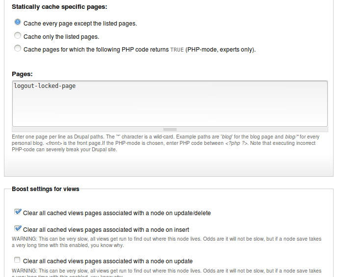
The following assumes that you installed the Protected Node rules extension module. Without it, you won't be able to change locks. Create a new Triggered rule.
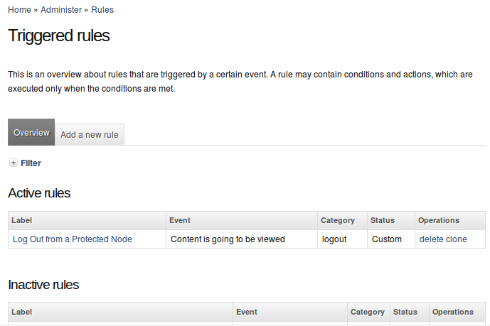
The rule makes use of the trigger (event) named Content is going to be viewed. Don't forget to enter a label. This should be something like "logout page name".
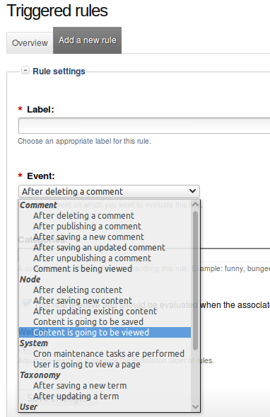
You are likely to want a condition since without it any page (node) being viewed will react to the event and lock the user out (which means the user can never see the page.) A simple condition is to compare the node identifier (nid). This can be done with the compare numbers condition.
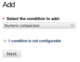
The condition makes use of a token (you have to have the Token module installed with this method!) with Can't find nid to include! as one of the numbers. That way you can make sure that the user is about to view your Log Out page. Note that you could also make use of a specific node type, you could send the user to the front page and detect that event, detect that the node has a specific term... the list is not limited to using the number comparison and other methods do not all require the use of the token module.
A simple way to see the number of a node, in case you have clean URLs with the automatic URL path aliases is to edit the page. Then the URI includes the number: node/###/edit. Make sure to enter that number in Number 2 of that condition form.
At this point we know that we are on the log out page. We want to load the node that is currently unlocked so we can lock it. This is done with a Load content by id action or similar. Change the Content ID with the node identifier of the node that needs to be locked.
Now, in the set of actions include the Lock the node away from the current user action and give it a weight of 1 so the load always happens first. Note that the lock needs to happen on the unprotected node, so your rule has to load that node first (since the Thank You page would be another node,) then apply the action on that node and that is done by selecting the node in the drop down.
Note that your actions can include as many Load node and Lock the node away from current user... as you need. So the same Thank You page can be reused to lock many different nodes.
- 1. Create a new rule with Content is going to be viewed as the trigger.
SimpleMenu (The module —)
The SimpleMenu module for Drupal 6.x and 7.x offers a drop-down menu that inserts itself at the top of your browser window on your website.
The menu can be fixed1 or scroll with the page.
By default, SimpleMenu presents the Navigation menu in Drupal 6.x and the Management menu in Drupal 7.x. You can change the SimpleMenu settings to display a different menu and show it on another tag than the Body tag.
The following pages describe how the SimpleMenu can be setup and different known issues and how to handle them.
- 1. At this time the fixed menu doesn't handle very long menus properly meaning that some menu items will not be accessible (disappear at the bottom of the page.)
Simplemenu Settings
Menu Settings
Menu
Select the menu to be displayed as the Simplemenu. By default, we display the Navigation Menu which makes the most sense for administrator (as the Simplemenu was primarily created for administrators wanting to quickly go to all administration pages.)
Theme
Select a theme to display your Simplemenu items and dropdowns. The default is called original.
The themes reside in the module sub-folder named themes. Each theme is defined in a specific directory named after the theme. That name is what appears in the dropdown in the settings.
It is possible to add new themes as required. You may want to start by copying an existing theme and tweaking it.
Hide when empty
This check box indicates whether the menu should be hidden when empty. By default, you get a message saying that the menu is empty.
Note that should never happen with the default navigation menu, although if you allow all users to see the menu, anonymous users may not have access to any menu items, rendering it empty, and thus hiding the menu in this case is probably a good idea otherwise users may wonder what the heck is that message about?!
Simplemenu Settings
Scroll of fix menu
The Simplemenu can scroll with the page (the default) or be fixed at the top.
Fixing the menu at the top has two small issues:
- The scrolling of the page remains 1 whole page so you lose a small part of what is being scrolled as part of the page is hidden at the top of the screen;
- The "Site configuration" sub-menu is often growing to a size taller than your page and thus the items at the bottom become inaccessible.
In practice, though, it is generally better since you may scroll on your page and still access the entire Navigation menu.
Hide Delay
The time it takes to hide the menu when the mouse goes out of any one item.
This is important since while moving the mouse around to access an item you often move it outside of the menu. This delay prevents losing the menu at such time.
The default is 800 milliseconds.
Show Effect
Show an effect when opening the dropdown sub-menus. By default these effects are very fast (less than a second.)
The default is the Fade effect.
- Fade — fade the menu in and out
- Slide — slide the menu in and out; if you have large dropdowns, this may not always look good
- None — no effect at all
Note that if you let many users access your Simplemenu, many will not have a powerful computer. This means the effect may be a problem for them. In that situation, I recommend None.
Show Speed
The speed at which the Show Effect is to be shown. By default, the effect is set of Fast.
The best way to know how it looks is to test the different settings in your browser.
Advanced Settings
Show to user ID 1
Whether the menu should appear to the top administrator or not.
By default it is shown to the administrator.
However, some administrators like to make use of the Simplemenu for their users and themselves make use of another administration menu. In that case, this feature offers a way to prevent displaying both menus at the same time.
SuperFish version
Because the Simplemenu has to work with many other modules and at times these other modules also make use of SuperFish, this option was created so you can decide which version is compatible with these other modules.
The special option "Custom or theme" is used when another module or theme already inserts SuperFish (as it should never be inserted more than once on the same page.)
Scope of Simplemenu menu variable
Simplemenu makes use of JavaScript. The PHP code generates a large JavaScript variable with all the necessary menu information. That variable is saved in the header by default. In some circumstances, that may not work right and thus it can be moved to the footer.
There should be no difference between either position, it is just more usual to have it in the header.
Another reason to put it in the footer is to accelerate the loading of your pages, especially if you offer the menu to all your users instead of just admins.
Cache the Simplemenu variable
The Simplemenu variable is pretty large and costly to rebuild on each access. It is possible to cache it so it is not regenerated every time you access your website. If you experience any problems (i.e. menu not being refreshed properly) try turning this feature off.
Menubar CSS z-index value
The Simplemenu drop-down menus are expected to appear over all the other items on the page. At times, other modules add an object with a z-index higher than the default used by Simplemenu. This option let you change the z-index to any large value.
For example, if you are using AddThis, the z-index needs to be set to a very large value: 2,000,001 (without the commas.)
Similarly, you may want the Simplemenu to appear below other objects (i.e. a pop-up window such as lightbox.)
Dropdown CSS z-index value
The Simplemenu drop-down system has many levels, the first is the Menubar appearing at the top. The second and following are the drop-downs. The CSS z-index of these can be changed using this input box.
There should be no need to change this z-index since all these items appear inside the menubar block and thus follow that z-index first. I first added this feature thinking it would be necessary. At this it is set to -1 and should certainly remain that way.
CSS select to attach menu to
By default, the Simplemenu is attached at the very top of the screen. To do so, we attach it to the BODY field. This option let you change the HTML item where the menu is attached.
It is particularly useful when you want to move the menu somewhere in your website page.
For example, you may have a Flash animation at the top and you do not want to mark that Flash animation as having a transparent background (i.e. it would be slower to play!) Thus, you want to move the Simplemenu widget under that Flash animation. It is simple. Look for the tag in your HTML that appears after the Flash animation and enter its name in this box. Say your HTML looks like this:
  <div id="header"><embed ... flash information ... ></div>
  <div id="content"><?php echo $content ?></div>
Then the CSS selector is div#content or just #content.
Attach method
The Simplemenu is attached to the specified HTML item in one of three different ways:
Prepend
Attach it at the beginning of the specified item. From our previous example, you'd get:
  <div id="header">...</div>
  <div id="content"><div id="simplemenu">...</div>...</div>
Append
Attach it at the end of the specified item. From our previous example, you'd get:
  <div id="header">...</div>
  <div id="content">...<div id="simplemenu">...</div></div>
Replace
Replace the specified item with the menu item. This can be done only with themes that have a special item that is expected to be replaced by the Simplemenu code. This is useful if you want the menu to appear at a specific location that cannot otherwise be obtained with the Prepend or Append features.
For example, you may want to have the menu between the header and content as defined here:
  <div id="header">...</div>
  <div id="place-simplemenu-here">...</div>
  <div id="content">...</div>
This may allow the menu to be wider than the content block. The CSS selector would be set to #place-simplemenu-here.
Theme Exclusion
Some themes are not compatible with the Simplemenu feature, although newer versions of this module are quite robust and I have not myself found a theme where the menu fail miserably, I'm sure a few still exists.
These check boxes or table1 allows you to prevent the menu from appearing whenever the website is used with particular themes.
Detect pop-up windows
This option is a smart feature. It checks a variable in JavaScript which is not set unless the window is considered a pop-up window.
The problem is that many times this assumption is wrong, especially when you clicked on a link from another website with the target="_blank" flag. Then the pop-up code thinks the new window is a pop-up (which in a way is true.)
By default, this flag is still set, which is probably wrong... but it has been that way for ages so I hesitate to change it.
The other way to avoid the Simplemenu in pop-up windows is to add the URLs in the Show block on specific pages (see below). That may not always be possible though (i.e. some pages may at times be shown as pop-ups, and at times not so...)
For detailed information, check Handling of Pop-up Windows by SimpleMenu.
Allow Simplemenu to call the theme() function
By default, Simplemenu is written to avoid calling to the theme() function. It is done so because otherwise attempting to change the theme with another module, such as themekey, fails.
However, once in a while, it is necessary to call the standard theme() function because it will further tweak the HTML generated by Simplemenu. For example, the Simplemenu Inactive Parent Menu requires the theme() function to be called. It captures those calls and tweak the menu item and change the anchor links (<a> tags) into plain text (<span> tags).
Show block on specific pages
This feature is used to allow Simplemenu on specific pages or not.
This is very similar to the same box of the Blocks interface.
By default, this feature prevents Simplemenu from appearing on the IMCE pop-up window and the noderelationships pages which are shown as pop-up windows.
Any number of pages can be added here.
- 1. Depending on the number of themes you've got, the settings will display the list of themes in a different way. When you have a large number of themes, we switch to a select list which makes it easier to select the themes.
Handling of Pop-up Windows by SimpleMenu
Feature
By default, SimpleMenu is not shown on pop-up windows. There is a flag in the SimpleMenu settings that can be unchecked to avoid this side effect. The pop-up capability is often detected when you open a new tab from the current window. It will depend on the browser and the link being clicked1.
Quick Fix
When the menu is only used by the administrators, it is possible to simply open a new tab and copy and paste the URL from the existing window with the missing menu to the new tab and hit enter. The menu will then appear in new tab and you can close the old tab where the menu is missing.
This works in all cases, but is really workable only for administrators. It can also be annoying after a while to have to transfer from one tab to another.
Pop-up Window SimpleMenu Settings
 If you do not use any pop-up window, you can go to the global settings and turn off the Detect pop-up windows checkbox.
Turning off the Detect pop-up windows checkbox bypasses the JavaScript test. This means that whether you are in a pop-up or not, the menu will be inserted in the window.
In most cases, this will not be a problem on a Drupal site.
There are two known places that will get the menu when they should not:
- The IMCE pop-up window2,
- The pop-up API using IFRAME to display other windows within a page.
Pop-ups and Pages
If the JavaScript code is really a problem, you will need to turn off the Detect pop-up windows checkbox. This means you will see the menu in pop-up windows.
To paliate to this problem, you may add the path to pop-up windows in the Pages text area and select the Show on every page except the listed pages.
Often, you cannot see the path to a pop-up. The right mouse button should give you the option to open the Properties where you will find the path.
Pop-ups and Themes
It is also possible to hide the SimpleMenu based on which theme is being used to display a page. If you can use a different theme for your pop-up windows, then you could also forbid the use of SimpleMenu with that theme.
Pop-ups and attachment
 You may change the default attachment of the SimpleMenu bar. By default SimpleMenu is attached (prepend) to the body tag. Instead, you can enter the identifier of an object such as #wrapper. You may also enter the name of a class. In tha case, the SimpleMenu bar is attached to the first element marked with that class.
This works whenever your pop-up windows do not use the default page.tpl.php and thus do not include a #wrapper element. When the same page template is used for pop-ups, this method does not work.
- 1. We are trying to ameliorate the code, but it is not easy to make it work properly 100% of the time.
- 2. You can find the IMCE module on Drupal.org.
SimpleMenu Custom Theme
Introduction
The newer versions of SimpleMenu allows for an easy way of adding custom themes.
There are two main ways to add new SimpleMenu themes:
1. In the simplemenu themes folder;
2. In your theme folder.
SimpleMenu themes folder
CSS
If you look under the simplemenu folder, you will see a sub-folder named themes. You can place your own specialized themes in that folder to make them available system-wide (i.e. if you are using many themes or use one Drupal installation for many websites.) In other words, this folder is viewed as a global theme folder.
The themes folder expect a sub-folder with the name of the theme and at least one CSS file with the same name and the .css extension:
simplemenu/themes/<my_theme>/<my_theme>.css
The folder may include other files such as images of arrows replacing the default simplemenu system icons.
Setup
In order for your theme to be used, go to the main SimpleMenu settings screen and choose your theme as the SimpleMenu theme. If you already had the window open when installation the theme sub-folder, it will not appear in the list. Reload the page and you will now see it.
Make sure to save your changes.
Now SimpleMenu uses your CSS file.
Theme specific SimpleMenu CSS
You have two ways to make the CSS of a specific theme work with SimpleMenu.
Overwriting
This method is what is used in most cases. You can overwrite all the CSS entries from the default SimpleMenu themes in your theme style.css files. This way you make sure that your look will work in all situation.
This method is quite useful as it requires no changes to the SimpleMenu settings and thus the default SimpleMenu theme will automatically kick in as required (i.e. Administration theme, etc.)
Custom Theme
This method allows you to completely avoid the SimpleMenu CSS file. This is a selection available in the SimpleMenu settings screen.
The difference between the Custom Theme and the Overwriting method is that the custom theme does not require you to overwrite every single CSS entry. Therefore, it simplifies the handling of the CSS greatly.
It is otherwise very similar to Overwriting.
Note that in this case switching between themes may cause a problem since only themes that now have SimpleMenu CSS data will work properly. Other themes will show the menu unthemed.
Sharing Themes
New themes are very welcome. Please, attach them to the SimpleMenu issue queue.
If you create a special theming for your own theme, simply check those changes to your theme CVS repository. You may want to let people know that they need to use Custom Theme if you do not overwrite all the CSS from the default simplemenu stylesheets.
Simplemenu Inactive Parents
Description
A simple menu is composed of parent menus and children menus. A child has no drop-down menu and a parent does.
By default all the menu items are active, meaning that they all are links one can click on to reach the corresponding destination.
This simplemenu extension allows for turning the link off by replacing the anchor reference in a named anchor. The HTML tag being the same, the simplemenu looks the same, but the item cannot be clicked.
At this time, there is no option to make some of the parent items clickable and others not.
Setup
There is no settings for this module. Installing it runs it. To stop this functionality, disable the module.
NOTES
This module makes use of the theme registry. Remember that the registry is cached and thus it may or may not work because the cache is not properly reset. In order to make sure, before reporting a bug, you should clear your theme registry cache (the Admin menu or Mini modules offer such a feature.)
Known Issue
By default, Simplemenu is set to avoid calling the theme() function call.
Calling the theme() function from a hook_init() callback prevents the system from changing the theme as defined by other modules: blocks, administration theme and other theme changers such as themekey.
A call to theme() forces the $default_theme global variable to be set, and since that theme has now been used, there is no changing back to another theme afterward.
However, this module hacks the theme() call generating the menu items. In other words, having theme() called is your only hope to get the inactive menus to work.
 function")
This snapshot shows you the default state of the flag which means that this very module will not work as noted in the IMPORTANT NOTE at the bottom.
See other Simplemenu known issues.
Simplemenu Upgrade Path
Version 7.x
Version 7.x-1.x-dev is a starting point... It is not complete, although it shows you a functional Management menu as a dropdown. More to come as time allows... See issue [#791664] for more info.
Version 6.x
Version 6.x-1.13 fixes the vertical menu problem which had to do with CSS caching getting lost.
Version 6.x-1.10 to 6.x-1.12 fixes the non-called theme() function versus the other sub-modules that have callbacks through the theme() calls. However, we really need to have callbacks instead. Added horizontal and vertical themes. Attempts to fix to the vertical menu problem (because the CSS file could be deleted and not regenerated.)
Version 6.x-1.9 fixes the non-working cache when private file folder is in use. Added a new theme: blackblue.
Version 6.x-1.8 fixes a couple of problems with themes (re-)introduced by calling the theme() function in the hook_init() function. This was solved by re-writing the menu output generator. There is a switch flag in the global settings so you can choose one method or the other.
Version 6.x-1.6/1.7 include the latest fixes and should work really good for most. I should not have much changes to this version for a while (there are still some enhancements I'd like to make though.) If you have problems, don't hesitate to post issues.
Version 6.x-1.5 includes new features and bug fixes (or a new feature to help handle a bug such as the z-index textfield.) Some of the new features: (1) possibility to stick the menu at the top of the screen without it scrolling; (2) dynamically change the z-index parameter; (3) call drupal_alter() so other modules have a chance to modify the menu before it gets displayed; (4) multi-menu support; (5) inactive parent items; (6) separate module for Devel menu support.
Version 6.x-1.3/1.4 includes several fixes that were posted in the issue queue. (Note that 1.3 has a problem, some files are missing... they were not properly tagged. If you had 1.2 and just extract over 1.2 it will work, otherwise just get 1.4) If you have problems upgrading, please check this issue: [#801030]
Version 6.x-1.2 fixes an issue where the theme exclusions don't work, and subsequently can cause problems with displaying or not displaying the menu on certain paths.
Version 6.x-1.1 fixes compatibility problems with Zen theme, fixes an issue with the Black and Blue theme when using Garland and adds a setting to disable the menu on specified paths. More importantly, there is a fix for a bug that made it impossible to administer blocks for non-default themes.
SimpleMenu Known Issues
SimpleMenu Disappears
There following are a few of the main reasons why SimpleMenu disappears.
Pop-up Windows
By default, SimpleMenu wants to hide itself in pop-up windows. This is a feature.
The reason is that many websites will open pop-up windows for all kinds of extra-features such as uploading an image or printing some description of an image or the definition of a word or product.
These windows should not include the SimpleMenu bar.
There is a dedicated page giving several different ways to fix this problem on your website.
Menu Overflow
 Very long menus will disappear on the edges of your screen (bottom and right).
Unfortunately, superfish does not provide a feature to open the menus on the other side or break menus in multiple columns. This would be the job of superfish, not simplemenu.
There is a work around which is to edit your menu and make it fit. This can be somewhat annoying with the Administration menu, yet it works very well even when you update modules (i.e. the item will not move back to their original position unless you move them back there.)
CSS Overflow
 The Internet Explorer browsers have a limit to the number of CSS files that can be included with the <link> tag. This limit is between 30 and 32. There is no work around to break the limit, however, it is possible to reduce the number of CSS files by going to your performence administration screen and turning on the Optimize CSS files feature. This should limit the number of CSS files to 3 or 4 depending on the theme you are using.
IMPORTANT NOTES
This has been corrected in Drupal 7.x with the use of <style>@import ...</style> instead of <link> tags. Drupal 7.x users should not experience this problem.
jQuery or SuperFish Conflicts
Although there should not be any jQuery conflicts, it has been reported that in some cases SimpleMenu breaks with more advanced jQuery versions. I use jQuery Update and thus pretty much always have the latest version running. For this reason, there should not be any problem with the jQuery library.
SuperFish has been reported to not work correctly when other modules use a different version than SimpleMenu. The Settings let you choose between different versions and custom. If another module always inserts SuperFish, then selecting custom is probably your best bet.
Simplemenu doesn't work with private files
There has been problems with older versions trying to save the dynamic CSS file in the private file environment. This has first been solved by using the default CSS. This means the dynamic CSS is not available (although nothing prevents you from editing the default CSS file as required by your website.)
Since version 1.14, private Simplemenu with dynamic CSS works when you also install ctools. This is because ctools now has a mechanism to save CSS files in the private files environment and make them work right.
IMPORTANT NOTE
The ctools module is not a forced requirement of Simplemenu and therefore by default the dynamic CSS generated by Simplemenu will not work with a private environment (unless you already had ctools installed on your system.)
Simplemenu doesn't look right
At times, the theme you are using will re-define the menu CSS without protections. In that case, those changes will eventually affect Simplemenu.
There isn't any way that I know of to fix the problem without having to edit the CSS of the theme you want to use and make the ul.menu entries play nice with Simplemenu. In practice, this generally means changing CSS like this:
  ul.menu li {
    padding-left: 1.3em;
    color: blue;
  }
into something like that:
  #page ul.menu li {
    padding-left: 1.3em;
    color: blue;
  }
(obviously, #page is an example, different themes use different names for the main div such as #main, #screen, etc.)
Note that you may have to add a <div id="..."> tag around the entire content of your page.tpl.php. If the theme you are working on has several page-*.tpl.php make sure to edit all of them.
And of course, if you have a better solution than mine, especially one that would not involve the editing of someone else theme, then let me know! (by posting a comment here, or even better, an issue on Drupal.)
Simplemenu Inactive Parents Menu & parents still active
When you install Simplemenu, by default, it does not call the theme() function which the Simplemenu Inactive Parents Menu uses. You want to go to the Simplemenu global settings and turn on the Allow Simplemenu to call the theme() function flag on.
For more info, check the Simplemenu Inactive Parents Menu documentation.
Horizontal menu separator not working (I see the - instead)
The Horizontal menu separator capability is very specific to the Simplemenu system and only work when the system theme() function is not called.
This means it only works with the Allow Simplemenu to call the theme() function flag is off, which is the default.
As a side effect, this means it is incompatible with the Simplemenu Inactive Parents Menu module.
Table of Contents (The module —)
The Table of contents module is used to generate a table with a list of all the content of your pages.
The module searches for the header tags (H1 to H6) and transforms those into a list of items used in the table of contents. Note that this module does not have the capability to generate a table of contents for multiple pages. However, used with the Views module, it is possible to create pages referencing multiple sub-pages.
The features include a way to number the items either with the automatic HTML ordered list feature (OL) or with an internal system that counts the headers and generates numbers as expected for sub-lists (i.e. 1., 1.1, 1.1.1, 1.1.2, 1.2, 2., etc.)
The table of contents can also reference all the attachments present on your page.
This documentation proposes to teach you how to install and make the most out of the filter.
Table of Contents Overview
The Table of contents module is used to generate a table with a list of all the content of your pages.
The module searches for the header tags (H1 to H6) and transforms those into a list of items used in the table of contents. Note that this module does not have the capability to generate a table of contents for multiple pages. However, used with the Views module, it is possible to create pages referencing multiple sub-pages.
The features include a way to number the items either with the automatic HTML ordered list feature (OL) or with an internal system that counts the headers and generates numbers as expected for sub-lists (i.e. 1., 1.1, 1.1.1, 1.1.2, 1.2, 2., etc.)
The table of contents can also reference all the attachments present on your page.
This documentation proposes to teach you how to install and make the most out of the filter.
Table of Contents Settings
Filter Configuration
 At this point, most of the Table of Contents configuration is done in the Table of Contents filter.
This means multiple Input formats allow you to make use of several different configurations.
First, go to the Input formats screen.
Administer » Site configuration » Input formats
In the list, check the Table of Contents filter. The Assign an ID to each header should NOT be selected if you are using the Table of Contents with that filter. Otherwise, each header will be parsed twice (it is safe, computationally and visually, but useless!)
Save your changes, and go back to that Input format (unfortunately, Drupal 6.x takes you out of the Input format when saving the format selection.)
At the top, click on the Configure tab. Among the different configuration, one is the Table of Contents configuration. Open the field set by clicking on the title if it is closed, and choose the different configuration options as described below.
Once done, make sure to Save your changes.
Table of Contents Configuration
The Table of Contents includes many flags and other fields. The following explain each one of them and the possible interactions between the different options.
Table of Contents On/Off features
Hide the table of contents tags
When this flag is checked, all the [toc] tags are removed from the pages using this filter. The tags have no effect.
This feature is used when someone decides to not use tables of contents anymore and does not have the time to edit each page to remove the tags.
All the other settings will be ignored when this flag is turned on.
IMPORTANT NOTES
Remember that this is only in this one filter. If you use multiple filters, you may have to do the same in each filter.
Whether an automatic table of content should be added
By default, no Table of Contents is added to your pages unless you include a [toc] tag.
This option let you choose when a Table of Contents is added to your pages.
The Table of Contents can be placed at the top or at the bottom.
You will have to indicate how many headers need to be defined in your pages before a Table of Contents is added in this way. This option is defined below.
Number of headers before an automatic table of content is added
This option is used only if one of the automatic Table of Contents feature was selected.
This number is used to know whether the Table of Contents should be added to your page or not. The filter first runs through your page to determine the number and add identifiers to all the Header defined in the page. If the result is equal or larger than the Number of headers before an automatic table of content is added, then the Table of Contents is added.
Remove Table of Contents tags from teasers
This is certainly the most controversial feature of the Table of Contents.
This option let you decide whether the module automatically creates the teaser in order to add the option to the teaser. This is important if you do not want to have the Table of Contents include a summary in the teaser. The problem of adding the Table of Contents in the teaser is that it parses the teaser only (not the full node) and thus it is generally quite incomplete.
Note that this feature has the unexpected side effect of creating the teaser and this often throws off the users of Drupal who are not used to see a separate teaser from the rest of the page content. Even me, I seldom use it in some circumstances such as when I define a product with an icon.
If you think that you never ever use the teaser, notice that Drupal will automatically create them for you. If you do not have any links to a place with teasers, then it probably is okay to ignore them and thus not turn on this feature.
Table of Contents Security Options
Allow users to override the settings within the table of contents tag itself
By default, all users will be allowed to override the Table of Contents settings.
Uncheck this flag to prevent users from changing the Table of Contents settings from the [toc] tag itself. The settings will still be read, but ignored.
See the [toc] tag documentation for more information about the available options.
Ensure title is safe (i.e. use check_plain() to avoid XSS attacks.)
This option is set by default and should probably always be left that way on any site where more than one user has edit permissions.
When not checked, and the users are allowed to override settings, then a user can enter a [toc] tag with HTML. Although the HTML should be parsed by your other filters before the Table of Contents is reached, for stronger security, we also call check_plain() by default. This flag prevents the module from calling the check_plain() function.
Table of Contents Box
Table of Contents Title
The Table of Contents has a default title that can be changed here.
It can also be changed within the [toc] tag if you allow your users to do so.
List Type [REMOVED since v3.7, see Numbering below]
 Defines the HTML tag used to create the Table of Contents list.
This can be set to Ordered list or Unordered list.
WARNING
The Ordered list feature means that the module generates a list using the <ol> tag. That tag has the side effect of adding numbers in the front of each item. These numbers are automatically added by the user's browser. If you prefer to use the module numbering capabilities, you must select Unordered list here or you will get double numbering (see Can't find doc_table_of_contents_known_issues to include!)
Minimum heading level
Define the minimum heading level used in your Table of Contents.
The default is H2 since that's what expected in your pages, H1 being used for your titles. Some websites may use H2 for another purpose and thus may ask Table of Contents to start at H3 or more.
The minimum heading level must be smaller or equal to the maximum heading level.
IMPORTANT NOTE
This minimum is not taken in account when the headers are automatically numbered by this module. This means numbering starts with the first header encountered and increments as required ignoring the minimum and maximum declarations (see Can't find doc_table_of_contents_known_issues to include!)
Maximum heading level
Define the maximum heading level used in your Table of Contents.
The default is H3 because most often you do not want to show the full depth of your document in your Table of Contents.
The maximum heading level must be larger or equal to the minimum heading level.
IMPORTANT NOTE
This minimum is not taken in account when the headers are automatically numbered by this module. This means numbering starts with the first header encountered and increments as required ignoring the minimum and maximum declarations (see Can't find doc_table_of_contents_known_issues to include!)
Include link to hide/show table of contents
Whether the link used to hide and show the Table of Contents should be included. By default it is.
This feature makes use of some JavaScript. If you write a website that should not make use of JavaScript (or very minimal use of it,) then you should turn this feature off.
IMPORTANT NOTE
The HTML Filter removes <script> tags. This option will not work when the Table of Contents filter is placed before the HTML Filter, or any other similar filter.
Start with the table of content collapsed
When the hide/show capability of the Table of Contents is turned on, it is possible to ask the system to hide the table at the start. Users can then click show to see the table.
This feature makes use of some JavaScript to hide the table on the client's machine. In other words, if the client does not have JavaScript, the Table of Contents will appear opened and the hide/show links not made available.
Table of Contents Headers Handling
Select what is stripped from the header titles
XML allows for many characters in a tag identifier. By default, we remove and replace some of the character in an automated way. You may remove more characters to make the identifier compatible with other sub-systems such as JavaScript or VisualBasic (ASP).
The XML identifiers can be composed of:
ID and NAME tokens must begin with a letter ([A-Za-z]) and
may be followed by any number of letters, digits ([0-9]),
hyphens ("-"), underscores ("_"), colons (":"), and periods (".").
The module ensures that the XML standard is respected. The other characters that you can remove are:
- All the digits (0-9)
- All the dash characters ("-")
- All the period characters (".")
- All the underscore characters ("_")
- All the colon characters (":")
By default, you should not have to chagne these flags. To use the identifier in JavaScript code, make sure that the dash, period and colon characters get removed.
The option uses the text defined between the start and end tag of the header as the default text for an undefined identifier.
WARNING
The module ensures that all the identifiers are unique within the page (if defined in your HTML Drupal template, then it won't be seen.) However, the characters of existing identifiers are not checked for validity. You are responsible for those.
IMPORTANT NOTE
This feature also runs when using the Assign an ID to each header filter. For this reason, you should not assign both filters to the same Input format.
Identifier introducer
When the identifier cannot be generated from the content of the header tag or the feature is turned off, a default identifier is created. That automatic identifier is the concatenation of this identifier introducer and a number.
Identifier and number separator
The identifier introducer is followed by this separator and then a number.
The separator can be set to any character that is a valid HTML identifier character (although at this point the module does not prevent you from using invalid characters.)
If you select the section number as the extension of the identifier introducer, then each section number will also be separated by this separator.
The default separator character is the dash (-). Usual characters are dash (-), underscore (_), period (.) and colon (:).
Use the underscore when these identifiers are also manipulated in JavaScript.
How to generate missing header identifiers
Whenever a header is found, the filter searches for its identifier (id="..."). If undefined, the identifier is automatically generated by the Table of Contents filter.
The possible options are as follow.
Use header title
This option means the module uses the text between the opening and closing header tags. This works for most latin languages since we can transliterate the accentuated letters and double letters such as ß or œ.
However, for Asian languages and any other script language, the transliteration does not work and most of those letters are not allowed in identifiers. In that case, this choice is not a good choice.
Create a random identifier
This option uses the identifier introducer followed by a random number. If you do not number your headers and do not want to have some implied order via the identifiers, this may be a good choice.
WARNING
Each time the page is regenerated, a different identifier will be generated. Users will not be able to create links with to those anchors.
Use the "Identifier introducer" and an incrementing number
This option uses the identifier introducer followed by a number. The number starts at 1 and is incremented by 1 each time an anchor is found.
This is a good choice if you do not otherwise number your anchors.
Use the "Identifier introducer" and the sections
This option is very similar to the previous one, but instead of an incrementing number, the current section numbers are used. Thus, when header 3.5.2 is being parsed, the numbers 3, 5 and 2 are used in the identifier. The identifier separator is used between each number. By default, header 3.5.2 would generate the identifier: header-3-5-2.
Custom: call module_invoke("tableofcontents", $id) -- requires a module or theme that understands this API.
This option uses a callback that another module must implement. At this time, there is no known helper module to generate a header identifier. If you create one, please post a comment below so I can add a link to its project page.
This means this option should not be used at this point.
List of tags allowed in table headers
This option let you specify a list of tags to be kept in the Table of Contents titles. You may clear that list completely to just remove all the tags.
By default, all inline tags are accepted.
NOTE
Some people pointed out that some of the tags listed are deprecated. First, note that most, if not all, browsers support them. Also, if you cannot otherwise use those tags (i.e. FCKeditor uses <strong> instead of <b>) then it does not matter since those tags will not be in your page at all (the Table of Contents does not add those tags to your titles.)
Table of Contents Other Modules Support
[Upload] Show attachments in the table of contents
Whether links to your file attachments should be added at the bottom of your Table of Contents.
The title used when the file was added to the page is used as the title in the Table of Contents. If not available, the filename is used.
[Comments] Add the comments to the table of contents
When this option is selected, the subject of all the comments attached to this page are added at the bottom of your Table of Contents. Note that some of those comments may not appear on your page. Those links may not work properly.
This feature should be used only on websites with a low number of comments.
[Comments] Select header level at which comments start
When you choose to add comments to your Table of Contents, you want to present them in that table as if at a specific level. By default, H2 is chosen which is the same as the minimum level. Any level can be used, although remember that an comment at a level higher than the maximum level allowed in this Table of Contents will not be included.
[Print] Show the table of content on Print pages
Select whether the Table of Contents should be completely removed from Print pages or shown but without links.
The default is to completely hide the Table of Contents from Print pages.
Note that the Back to Top links are always removed.
Table of Contents Back to Top Links
Back to top label
This field let you enter the label to display as the link to go back to the top.
NOTE
At this time, the label uses a CSS background image that cannot be clicked. This should be fixed in a future version by letting users enter HTML in this box, including an image if they wish.
Back to top location
Determine where the Back to top label is inserted.
You may insert right under the header (i.e. <h2>My Title</h2><div>Back to top</div>).
You may insert it right at the end of the block (just before the next header.)
You cannot insert it in both locations since you'd then have one right before and one right after each header.
Minimum level where Back to Top appears
The system checks whether the current level being closed is smaller than this value. If so, no link is added. For instance, if you have headers from H1 to H4, you may want to add links only at level H2 and H3. This option would be set to H2 for this purpose.
Maximum level where Back to Top appears
The system checks whether the current level being closed is larger than this value. If so, no link is added. For instance, if you have headers from H1 to H4, you may want to add links only at level H2 and H3. This option would be set to H3 for this purpose.
NOTE
If the Maximum is set to a value smaller than the Minimum, then no Back to Top link will be added. This is another way to turn off this feature.
Back to top anchor
By default, the Back to top link sends you back at the very top of the Table of Contents. However, it may be preferable to send users a little higher. If you are using only one theme on your website, and it has an identifier such as node-content, then you can specify that name in this box.
To know what names are available, right click on your page and select See Page Source. Look at the HTML tags before the Table of Contents and choose the name defined in the id="..." parameter.
Scroll back to the table of contents
jQuery allows for scrolling your pages. This flag let you choose to do so with your Back to top links.
If you audience is likely to have lower end computers, then it is discourage to use such a feature.
Table of Contents Numbering
Numbering method
Choose how your headers and titles in your Table of Contents will be numbered.
Note that a flag needs to be turned on for the headers to also be numbered.
The numbering method cannot be changed in the [toc] tag.
WARNING
The Ordered list feature means that the module generates a list using the <ol> tag. That tag has the side effect of adding numbers in the front of each item. These numbers are automatically added by the user's browser. If you prefer to use the Numbering method, you must select Unordered list in the List Type or you will get double numbering (see Can't find doc_table_of_contents_known_issues to include!)
No number
Do not number headers or titles.
Browser numbering (<ol> tag)
Use the <ol> tag (instead of <ul>) and let the browser add numbers. There is no good control for those, but in some cases this may be preferable.
Numbers 1., 2., 3. (like <ol>)
This numbering is just what you'd get with the <ol> tag. However, this enables the module to also number the headers.
Sub-numbers 1., 1.1, 1.2, 2., 2.1, 2.2, etc.
Advanced numbering without the zero. In other words, 1., 2., 3., etc. do not have an ending zero.
The numbering is what you'd otherwise expect. Note that the depth is not limited. So all 6 header levels may be used.
Sub-numbers with zero 1.0, 1.1, 1.2, 2.0, 2.1, 2.2, etc.
Advanced numbering with the zero. As you can see 1.0, 2.0, 3.0, etc. have an ending zero.
The numbering is what you'd otherwise expect. Note that the depth is not limited. So all 6 header levels may be used.
Add the number to the headers
When using an option other than No Number in your Numbering method, you can also have the module add those numbers to your headers.
Note that this does not work with the Ordered list option of the List Type settings. You need to make sure you selected Unordered list instead.
Numbering mode
Choose the type of numbers you want to use for your sections.
You can choose between, decimal, roman, letters, and hexadecimal. The roman characters and letters can be either lower or upper case.
IMPORTANT NOTE
At this time, you can only specify one numbering mode. If you have needs for different numbering schemes at different levels, then this feature is not (yet) enough.
Numbering prefix
Enter the character you want at the beginning of your numbers. This could be a bullet point, an arrow, an opening parenthesis or square bracket, or nothing (the default.)
Numbering separator
Enter the character you want between each number. In most cases, you want to use a period. Some Table of Contents use a dash (-), colon (:), or an underscore (_). When the prefix is an opening parenthesis and the suffix is a closing parenthesis, you could use a slash as the separator: (1/2/3).
Numbering suffix
Enter the character you want after all the numbers. The default is a period. A usual character is a closing parenthesis, especially if you used an opening parenthesis as the numbering prefix.
Table of Contents tags and parameters
Syntax
Supported Tags
The module supports 3 tags that all generate a Table of Contents.
The most popular is now [toc] since it is easy to type and works in WYSIWYG editors.
The old tag was a comment: <!--tableofcontents-->. This is a very good choice if you are not using a WYSIWYG editor because if you turn off the Table of Contents module, the tags disappear automatically. Contrary to the other tags, this one can include spaces before the name. So <!-- tableofcontents --> works too.
IMPORTANT NOTE
This tag will NOT work when written as is in your WYSIWYG editor since the < and > characters are transformed to < and > identities. In other words, they won't be recognized as introducer and closer by the module.
The last tag supported is the capitilized [[TOC]] tag. This is to support pages coming from a Wiki like system where that very tag is used. That way, those pages are supported as is in Drupal.
Parameter Syntax
The <!--tableofcontents--> and [[TOC]] tags are automatically transformed in a [toc] by the filter prepare callback function. This is why the rest of the documentation references that tag and not the others. In all cases, the tag can be followed by a set of parameters (including the [[TOC]] tag although it is not conventional in the other system.)
Parameters are keywords. All the parameters must be followed by a value. The value is defined after an equal sign (=) or a colon (:) and ended by a semi-colon. Note that all spaces between the equal sign or colon up to the value are ignored.
The syntax is as follow:
[toc param1=valuea; param2:valueb; param3: valuec;]
The parameters and their possible values are described below.
Type of Values
Boolean (bool)
A boolean value represents TRUE or FALSE. You may use any one of the following values to represent TRUE or FALSE:
| TRUE | FALSE | |
|---|---|---|
| Integer | 1 | 0 |
| Name | true | false |
Integer
Any valid value such as 123. Most parameters do not accept negative values although they are otherwise accepted (i.e. -123).
String
Strings are currently accepted as is. Note that a string cannot include a semi-colon. However, it may include a square brackets ([ or ]) when used with the new tag (i.e. [toc].)
Note that when used with the comment tag, you cannot use the end of a comment combination: -->.
Mode
Modes are specific strings. The parameter defines the list of modes that work with it. For instance, a list can be set to ordered or unordered.
Supported Parameters
The following list was started as of 3.6. Some of the parameters may or may not be available in older versions.
NOTE
In this documentation, the parameters are always presented in lowercase. However, the case is ignored. Thus hidden, Hidden and HIDDEN all work.
hidden=<bool>; (synonym: hide)
[toc hidden=true;]
The hidden parameter is used by the system to create a tag in the page teaser that hides the Table of Contents.
It is generally not useful in your pages unless the automatic Table of Contents option kicks in when you do not want it. This attribute prevents any other action and thus the headers will not be changed in anyway.
id=<string>;
The main identifier to use with the Table of Contents box. The default is "toc".
IMPORTANT NOTE
There can be only one item with the same identifier. The very first [toc] will get this identifier. Any others will not have any identifier.
title=<string>;
[toc title=Summary;]
Set the name of the Table of Contents. This string appears at the top of the Table of Contents box.
In order to remove the title, set it to the special value <none>. Note that in this case the hide/show link is also removed.
hideshow=<bool>;
The Table of Contents uses a small JavaScript to hide and show the list of labels. It is possible to remove that link by setting this parameter to false.
collapsed=<bool>;
The Table of Contents can start collapsed. This works with the hideshow capability. Note that the module uses JavaScript to actually collapse the box. In other words, users who do not have JavaScript still see the box non-collapsed.
list=<mode>; [DEPRECATED in v3.7]
Set the list mode of the Table of Contents. This option will get deprecated in a future version once the other feature removes the need for this option.
The <mode> can be one of:
- ordered (synonym: ol)
- unordered (synonym: ul)
This mode defines whether the Browser generates numbers (ol) or not (ul).
IMPORTANT NOTE
Since version 3.7 this parameter is accepted by ignored.
attachments=<bool>;
Defines whether attachments should be listed in the Table of Contents.
minlevel=<integer>; & maxlevel=<integer>;
[toc minlevel=1; maxlevel=6;]
Defines the range of headers accepted in the Table of Contents. This has no effect on which headers are assigned an identifier in your page: all headers are always assigned an identifier (and are numbered when that option is turned on.)
<integer> is limited to a number from 1 to 6.
Limits
If there is a parameter that you think should be added, feel free to post an issue. Note that all parameters available in the Input filters configuration screen cannot be added to the tag. Especially, the automatic feature, putting the tag at the top or bottom (you can do that yourself with the tag anyway,) and whether overriding parameters is acceptable.
Only add identifiers and optionally numbers to my headers
Proposition
The Table of Contents module uses the headers to get generated. Each header gets a unique identifier when none were assigned manually. The Table of Contents module uses the text between the start and end tags as the title to show in the table of contents.
Very good!
Now, you may not want the Table of Contents itself, but you like the idea to have identifiers in all your headers. This can be useful to create in-page links (a link with an anchor, i.e. #some-name at the end of your URL.) It is generally annoying to have to enter the identifiers by hand for each header and you may make mistakes.
Another side effect from the Table of Contents module: it can be setup to assign a number to each one of your header. It starts at 1) and moves forward to 1.1), 1.2), 2), 2.1), etc. Note that you can select your own style as well.
Solution
The solution: use the Assign an ID to each header filter. Once the Table of Contents is installed, that filter will be available in each one of your Input format. Select it and you will get the similar features as with the Table of Contents filter.
NOTE
This is what needs to be done whenever you want to use Table of Contents Block (unless you want include an identifier by hand, in each one of your headers, for every page...)
Nice Hack1
If you want a Table of Contents on a few pages, but not that often, and also want to have identifiers assigned to headers, set both, the minimum and maximum headers, to H12.
Now the headers will be transformed by the Table of Contents filter but the resulting table will be empty (because none of the headers will match your default selection.)
Finally, when you have a page where you want to show a Table of Contents, enter the tag with the minlevel and maxlevel parameters set to values such as 2 and 3 respectively.
- 1. This is just a side effect of the different options offered by this module. It is not hacking the code, CSS or anything of the sort.
- 2. H1 is often used for your main page title and should not appear in your page content. You could also use H6 which is rather rarely used except in advanced references...
Create a Table of Contents from a View
Setup
There are, I'm sure, many different ways to handle views with the Table of contents.
Here is what I think is the easiest at the moment:
1. Create a view and include a Title field (which generates a header for the title, most likely <H2>)
2. Create a node and include the view in the node using the Insert view filter1
3. Select a filter on this node that includes support for Insert views and Table of contents
4. If the filter is not setup to auto-generate the table of contents, insert a toc tag in the content
Save the node and verify that the table of content appears.
IMPORTANT
a) The auto-generate features may require more headers before it generates your Table of Contents.
b) The Table of Contents setup may ignore the <H2> tag, make sure it incorporate the headers that are required with your view.
NOTE
This method assumes that the view being used does not require dynamically defined parameters.
- 1. Note that the Insert view filter was found to have some security issues. Use with care. The project home page has additional information about this module.
Adding a Table of Contents to a view with parameters
It is possible to add a Table of Contents to a view that has to accept parameters1.
In this case, you do not want to use the solution of including the view in a node (with the Insert view filter, see Can't find doc_table_of_contents_for_views to include!) because then you lose the capability of assigning different parameters to your view (although, if the number of parameters is relatively limited, you could create one page per set of parameters supported.)
So, here, we offer a solution for you to include a Table of Contents using your view template. Basically, it reformats the view output by passing it through the Table of Content filter. The filter requires a format number and the text to be filtered.
<?php

  module_load_include('pages.inc', 'tableofcontents');

  echo _tableofcontents_replace_toc(2, '[toc]'.$rows) ;

?>
These two lines of code will prepend a Table of Content to the $rows text. The $rows text comes from the Views.
To append a Table of Contents, simply move the '[toc]' string after the $rows reference as in: $rows.'[toc]'
The module_load_include() call is necessary in case the tableofcontents.pages.inc file was not loaded.
The number 2 in the call to the _tableofcontest_replace_toc() function is the format identifier. The one main reason why you'd want to enter a specific format is to gain the flexibility of changing the Table of Content setup from the Drupal interface (from your Administer » Site configuration » Input format settings form.) Use the number 0 if you just want to use the default settings and what you specify in the view template, since it is possible to include parameters along the [toc] tag such as the title.
<?php

  module_load_include('pages.inc', 'tableofcontents');

  echo _tableofcontents_replace_toc(0, '[toc title:My View; minlevel: 2;]'.$rows) ;

?>
In this example I show how the table can be given the name My View and use <H2> as the minimum level.
- 1. Note that you need to write some PHP code. If you do not know how to do that, I'm afraid that this won't work for you. You may want to check out the Table of Contents and Insert view solution instead.
Upgrade from Table of Contents 2.x to 3.x
Make a Backup
DO NOT FORGET TO MAKE A BACKUP OF YOUR DATABASE & CODE.
That way you can come back to your previous version if anything goes wrong. So far, no one told me that they had a problem upgrading. Although version 2.x did not have any schema, the new module may modify nodes and generate incompatible tags.
Show stopper
Version 3.x has a new theme() scheme. It is much more powerful has it allows you to create your own header numbering, etc. However, if you already had a theme() overload in your theme, it will stop working until fixed.
Please, in this case, make sure to upgrade on a test system and see how and whether changes are required.
Upgrade procedure
Please, follow these steps one by one.
1. Did you make a backup of your database?
2. Disable the module from your website1
3. DELETE your existing tableofcontents folder
4. Extract the new version of the module
5. Enable the Table of Contents module on your website2
Enjoy!
- 1. Do no remove the tags from your nodes unless you do not want the table to appear there! You can safely keep those!
- 2. The Anchors module is gone. There are two modules: Table of Contents Filters and Table of Contents Block (new!) The Anchors filter is still available for those who want to use the Block. Otherwise, do NOT use it, it is a waste of processing time. That filter is named: Assign an ID to each header.
Table of Contents Known Issues
Various known issues with the Table of Contents module.
Teaser appear, FCKeditor accentuated letters, Back to top arrow, Filters interaction (JavaScript removal,) headers numbering, double numbering...
- A teaser was created automatically?!
- FCKeditor and Accentuated Characters
- Back to top arrow
- Filters interaction & the [hide]/[show] feature
- Headers numbering
- Levels mismatch
- Double numbering
- No Table of Contents appears
- Header Level Mismatch (Older versions)
- Table of Contents errors appear, why?
- Tweaking the order of my filters has no effect, why?
A teaser was created automatically?!
One of the features in the Table of Contents filter configuration settings is named:
Remove Table of Contents tags from teasers
This box should NOT be set if you do not want the teasers to automatically be created.
The other two main reasons to get the tag automatically added are:
- The use of the If no [toc], then create the table automatically, and
- The [toc] tag is present at the start (in the auto-teaser area1) of your page.
There are several tests before the module adds the teaser to the node and happen the [toc hidden=1] tag to it.
- Is this very flag Turned Off?
- Is there a teaser already?
- Is the Table of Contents filter not selected on that page? (i.e. page uses a format including the Table of Contents filter.)
- Is there already a [toc] tag in the teaser, if not, is the [toc] tag manual only generated?
If the last answer to any one of these questions is YES, then the teaser is not added.
For instance, if you did not include a [toc] tag in your body and the process requires the tag to insert a table of content (i.e. the automatic table of contents addition is not turned on,) then the teaser will not be created.
FCKeditor and Accentuated Characters
Users of the FCKeditor2 who use accentuated characters, may run in that problem where the editor changes letters such as é into é (their HTML entity.)
Those changes by the editor interfere with the code used to generate the header identifiers.
To fix the problem, change the ProcessHTMLEntities as following:
FCKConfig.ProcessHTMLEntities = false;
Similarly, for the CKEditor3 you want the following:
CKEDITOR.config.entities = false;
CKEDITOR.config.entities_latin = false;
CKEDITOR.config.entities_greek = false;
More info: ProcessHTMLEntities.
Back to top arrow
At this time, I use a background image via CSS to add the Back to top arrow.
This allow for you to easily switch the image, but it means the image cannot be clicked to go back to the top.
A later fix will be to offer you a text area where you can enter the Back to top HTML code. In that case, you could point to whatever image you'd like and the whole thing can be wrapped in an anchor so a user can click the arrow (or whatever other graphics) too.
Filters interaction & the [hide]/[show] feature
The Table of Contents module makes use of a small JavaScript snippet to get the [hide]/[show] link to work. Some filters will remove the JavaScript code for your safety...
Especially, the HTML Filter will remove most of the HTML tags that are not considered safe.
In order to avoid this problem, go to Administer » Site configuration » Input format, click on the format using the Table of Contents filter, click on the Rearrange, and move the Table of Contents filter after the HTML Filter or any other offending filter. Don't forget to Save once the filters are properly ordered.
Headers numbering
When asking the Table of Contents filter to add numbering to your headers (tags H1 to H6 found in your page,) it will do so to all the headers whether or not the [toc] tag or the Table of Contents settings specify a minimum and maximum header.
This means the resulting numbers in your Table of Contents may not look as expected (although they will be correct in the sense that the corresponding numbers will be used.)
For example, if the minimum level is set to H2, and you have one H1 tag at the start of your page. In your Table of Contents, the number start at 1.1 instead of 1.0, and the next H2 header is shown as 1.2, instead of 2.0 as you would otherwise expect. To palliate to this problem, remove the H1 tag or change the minimum level.
Note that the title of the page (often presented using H1) is not included in your Table of Contents, so that should have no effect here.
Levels mismatch
Note that the module expects your document to be well formatted. This means the headers should start at a given level, the level should increase one by one and never decrease to less than the first header found. Thus, if the first header is an H3, we should not find an H2 later.
At this time, there is no real way to avoid these two problems other than looking at your table of contents for consistency. Later, we may add some code to generate a warning whenever such malformed pages are detected.
Double numbering
The problem
 I will probably fix this problem at some point, but to keep the old system working as it was, I kept the option to choose between <ul> and <ol> separate from the advanced module auto-numbering feature.
This means you may choose two numbering systems at the same time: the <ol> + the module numbering. This means you will see the numbers overlap. The black numbers are the <ol> numbers added by the browser. Those numbers are not active and thus you cannot click on them to go to the specified point.
The blue numbers are part of the link and were added by the PHP code of the module. It is much more powerful as you can add several levels (1.0, 1.2, 1.2.3, 1.2.3.4, etc.) However, the module does not (yet) detect whether both options are used simultaneously. Therefore, the administrator has to do the setup properly.
The Solution
This was fixed in the newest version of the module. Upgrading may be your best solution.
There are two places in the table configuration that let you choose the type of list that you want.
Remember that the table of contents settings are found with the Input format configuration screen. This is found under Administer » Site configuration » Input formats, in that screen, click on the format using the table of content filter, then click on the Configuration tab.
The first is near the top. When that one says Ordered list, the module uses the <ol> tag. This means your browser will add the black numbers. Note that the Ordered list numbering capability only happen in the Table of Contents. The headers will not be numbered with this option.
The Unordered list makes use of the <ul> tag. This means your browser adds a bullet point instead of a number. However, the CSS coming with the module will automatically remove the bullet points for you. The result is a list without any bullet or numbers as far as the browser is concerned.
 Further below in the Table of Contents settings, you will find the Numbering method entry.
This entry can be set to No Numbers. That is the selection that you want if you used the Ordered list in the previous selector. This means only the Browser numbers will appear.
The Numbering method can be set to anything else when the List Type was set to Unordered list. In this case you can also ask the module to attach the numbers to the headers in your page.
When the Numbering method is set to No Numbers, and the List Type is set to Unordered list, then absolutly no numbers are assigned to each entry.
In our case, we changeed the List Type from Ordered list to Unordered list and got this result:

No Table of Contents appears
The minimum and maximum header specifications may exclude all the headers that exist in your page. In that case, the Table of Contents would be empty and thus the filter outputs nothing.
Please, verify all your settings to see whether you have headers at all levels and if not try to add others to trigger some output. You may also use the minimum and maximum parameters:
[toc ... minlevel=1; maxlevel=6;]
That will resolve the problem on the very page. The default minimum and maximum levels can be changed in your Input filter settings.
Header Level Mismatch (Older versions)
In older versions (2.x and older,) there was a problem with the table generation and different levels.
In fact, if you told the module that the minimum level was H3, but the modules finds an H2 tag, then you would have a negative level.
Similarly, if you said that the minimum level was H3, but the first header was an H4, then the table title entry for that H4 would be improperly indented.
Please check out the README documentation coming with the module for more detailed information on this problem.
Table of Contents errors appear, why?
If you are using a WYSIWYG editor, you may enter some invisible HTML code inside your [toc ...] tag. For instance, the HTML could end up looking like this:
<p>[toc ... minlevel=1; maxlevel=6;<div style="display: none;"> </div>]</p>
The <p> tag is normal, it should automatically be removed by the Table of Contents module. However, the <div> tag is there, but hidden. It will generate errors because the Table of Contents will detect what looks like parameters. To fix the problem, verify your page HTML code and delete anything that appears within the square brackets ([ and ]) and does not belong.
Tweaking the order of my filters has no effect, why?
The Table of Contents module uses the parser in three cases:
- Filtering
The filter is the default expected use of this filter. In most cases this is enough and works well. In this case, the order of your filters will affect the final outcome of your content.
- [vtoc] tag
The "v" tag is parsed by the tableofcontents_nodeapi() function when called with the 'view' operation. This means it happens after all the filters. Obviously, this means the order of your filters has no bearing on when the parser is applied in this case.
If you have a problem with a [vtoc] tag, you can try to change the module weight (that's the weight value found in the system module.) This may have other side effects though.
- Block
When using the Table of Contents block extension, it calls the parser too. The parser does not add a table of contents to the node, however, it adds the header numbers.
- 1. You can change the size of your automatic teaser from the default 600 characters to something smaller. (Look under Administer » Content management » Post settings) Although, in general, it is rare that you'd write so much before your Table of Contents. Some people also like to add the table at the bottom of the page. In that case, pages that are long enough will have their tag so far below that it will never appear in the teaser. Note that does not prevent the teaser creation if the automatic table feature is used.
- 2. The FCKeditor may not be the only editor affected by this problem. Other WYSIWYG editors may transform some characters in unexpected ways. So far, though, no one reported such a problem here.
- 3. The CKEditor is the new version of the FCKeditor and is now available for Drupal 6.x.
Taxonomy VTN (The Module —)
The Taxonomy VTN module for Drupal is used to display your taxonomies (also called vocabularies) in a dictionary type of a way.
By changing the CSS to your taste, you will really make it match your website look and feel.
The module is very flexible with a very large number of options as described in the following pages.
If you have any question feel free to post a comment on any one of those pages.
Creating Groups with Taxonomy VTN
Taxonomy VTN adds many fields in your taxonomy forms. When editing your taxonomy, one field is called Taxonomy VTN Group. This field is used to group different vocabularies (i.e. taxonomies) together in a group.
 The field accepts one or more group names. The names are case insensitive and are separated by commas. For instance, you could have three names such as: Kitchen, Utensils, Stainless Steel. Then another vocabulary could mention Kitchen and yet another Utensils, Wood.
The groups change the display in the Taxonomy VTN root page. A specific group can also be accessed using the URL:
http://www.example.com/taxonomy_vtn/group/<group name>
Note that the root folder does not directly link to the groups. The primary use of the groups are just to group taxonomies in your Taxonomy VTN root directory. Without the groups, all the taxonomies appear in alphabetical order.
In the sample below, the Development Languages and Site Index taxonomies where put in the Site group. Similarly, the Forums and MO Glossary taxonomies were put in the Utility group.
Parent/Child with Taxonomy VTN
Terms in a taxonomy can be organized as children of other terms. This generates a parent/child organization. For instance, you can have a term Fruit and mark Apple and Peach as children of Fruit.
The parent/child relationship can be used when you organize your Taxonomy VTN to shorten each page of your dictionary. The idea is simple: whenever you enter the top dictionary (taxonomy) page, you only get a list of the root terms (terms that are not children of other terms.) That list gives you access to the children terms and/or nodes of the parent term.
 There are three flags you can use to determine how the Taxonomy VTN module should display your lists of items in regard to parent/child relationships. The figure on the right shows the flags (click to enlarge.)
- Parent/child links
When this flag is set, the vocabularies in the root taxonomy_vtn display will have links to pages with the root terms, and the root terms will have links to sub-directory pages with the children of that parent. Children terms can themselves link to another page with their own children terms (there is no limit to the parent/child levels.)
- Show parent in children's list
If you want to let your users access the nodes including the parent term, you will need to give them a link to that page. This flag adds that link. The parent term will be included in the list as if it were a child term.
This solution works, although it is probably not the best. Most of your users will not think of looking for that link! The next flag is probably the one you want to use.
- Show parent's nodes after the terms if any
This option adds a list of nodes after the terms. The nodes correspond to the parent term. This only appears in sub-directory pages (since the root has no term representing it directly.)
Problems with Taxonomy VTN and their solution
The following are different problems you may encounter whenever you work with Taxonomy VTN. Those problems usually have a work around and the following pages tell you about the solutions available to you.
One or two of the taxonomy columns are too wide
It happens that a column in your main display look too wide. Say you use three columns, one may be real large and two are the normal size (1/3rd of the screen.)
In general this happens because you have a URL in one of your description. (If the URL is in the title, I strongly advice that you move it to the description.) Then the description shows up as wide as that URL. Long URLs will have a real bad effect making the column much wider.
There are two ways to solve the problem:
- Create a tiny URL, although tiny URLs may still be too big, it may help
- Change the settings of the taxonomy description so it accepts HTML and use an anchor with the link
The first solution can use a tiny URL from your site or using a system such as https://tinyurl.com/ (there are many systems now a day, offering this feature.) With a Drupal site, you can use Auto-Path or change your Apache setup to support node numbers without the /node/ keyword (assuming you have a short domain name too.)
For the second option, which makes use of the Taxonomy VTN system, you want to setup the module as follow:
a. Make sure to select an Input format that will allow for links in your taxonomy description

b. Write the URL using an anchor as in: <a href="http://www.example.com/of/long/url">Tiny-name or multiple words that will wrap around as expected.</a>
Using the Taxonomy VTN View feature
One of the options to link terms in a vocabulary to their view is:
taxonomy_view/voc-xxx/term-xxx
This option sends you to that path, exactly (where voc-xxx and term-xxx are numbers representing the vocabulary identifier and term identifier respectively.)
As is, it will tell you that the page does not exist. This is because the taxonomy_view path is to be created with the View module. To create a taxonomy VTN view, you want to define two arguments:
- Vocabulary, and
- Term.
The result is a list of nodes that you can control with very high granularity, sort the way you want them sorted... for instance, you may want to hide nodes of a certain type, or only show the nodes from a given type. You may just list unpublished nodes. You can sort on creation date instead of title. Everything that the views offers!
The minimum we recommend in the view:
Argument 1: Taxonomy: Vocabulary ID1
Argument 2: Taxonomy: Term ID1
Filter: Node Published (Yes)
Fields: Node: Title
Style settings: Style: HTML list
The Cute Menu (The Module —)
Introduction
The Cute Menu Drupal Module is used to create advanced dropdown menus. The module is free and can be found on the Drupal website.
The list of items can be grouped under a title. The title is a menu entry which cannot be clicked on.
The dropdown panes can include a header and a footer with images and text.
Note that to make full use of the Cute Menu capabilities, you will be required to write your own CSS to make it look the way you want it to look in your theme.
Cutemenu Overview
Introduction
The Cute Menu Drupal Module is used to create advanced dropdown menus. The module is free and can be found on the Drupal website.
The list of items can be grouped under a title. The title is a menu entry which cannot be clicked on.
The dropdown panes can include a header and a footer with images and text.
Note that to make full use of the Cute Menu capabilities, you will be required to write your own CSS to make it look the way you want it to look in your theme.
CuteMenu Installation & Uninstallation
Installation
CuteMenu can be installed like any other Drupal modules. Extract the tar ball in sites/all/modules. The module makes use of two tables in your database. If you do not want to use it anymore, make sure to Uninstall it before deleting the files or you will still have the tables hanging.
Go to Administer » Building site » Modules to select the module so you can use it.
Bug in the core menu system (until Drupal 6.9)
At this time (Oct 25, 2008) there is a "bug" in the core menu system that needs to be fixed for the CuteMenu to work 100%. The only problem is when you create a new menu, by default it won't save the CuteMenu selection properly (i.e. whether that item is a header, footer, title or a normal item--it will default to normal.) The patch is available in the module folder and there: https://www.drupal.org/node/326210
You do not need to install this patch. The work around is to create the menu item, then edit it and change the CuteMenu selection afterward.
The patch was applied to Drupal Core since version 6.10. Do not try to install the patch if you have Drupal 6.10 or better.
Uninstallation
If you want to uninstall the module, go to Administer » Building site » Modules and make sure the module is disabled. Then click on the Uninstall tab at the top of that page. There you will see a list of modules you can uninstall. Select the CuteMenu module and click Uninstall and confirm your willingness to do so. After you uninstalled the module that way, the tables added to your database will have been deleted.
Cute Menu Basic usage
Global Settings
CuteMenu has no global settings under the Administer » Site configuration. Instead, the settings are localized in the block and the menu items.
Look and feel
There is nearly nothing to do to use the default dropdowns. However, it is very likely that you will want to use Cute Menu with your own CSS. Feel free to start with the cutemenu.css file and add on to it. Look at the HTML output in your browser to see all the tags generated by the module. There are enough for you to create one CSS entry for each corner, each edge, the inside, different items aspects, and much much more.
Don't forget that the cutemenu.css will always be included, so you have to overwrite that CSS code if it isn't the default that you want to use.
Localized Settings
CureMenu adds elements as follow:
- One block per menu.
Go to Adminster » Site building » Block and find one new block per menu called CuteMenu: <menu name>
- Three extra checkboxes in the Block configuration screen to
- Let you display (default) or not the menus that do not have any sub-menus. In other words, if your menu has 5 entries, of which only 2 have sub-menus, checking the box will make these 2 menus appear, and the others will be ignored.
- Choose whether the top menus are links or not. By default, the top menus are not links because it is very confusing to a lot of people. This means you either won't use that specific page, or you will have a sub-menu to access that top menu page.
- Choose whether the top menus are also beautified (true by default.)
- One extra set of radio buttons under each menu item. For that you need to edit the menu item under Administer » Site building » Menus » <menu name>. Each menu item can be either:
- A header, displayed at the top of the menu,
- A footer, displayed at the bottom of the menu,
- A title1, displayed differently within the list of menu items, or
- A normal menu item (i.e. a link).
Notes:
- In a single set of sub-menu items, you can at most have one header and one footer.
- By default, items are viewed as normal.
- To hide a header, footer or title, mark the item as normal and disable it or simply delete the entry altogether.
- The header and footer can be links to nodes or views. In case of views, you need a Page with a valid path (the path needs to be exactly the same name as the view at this time.)
The Cute Menu module uses the menu item header and footer nodes, not the menu item itself. In other words, what appears in the CuteMenu dropdown is whatever the menu points to. However, if it is not a node or a view, it simply won't work (be ignored.)
The header and footer nodes can be given a title that starts with <none> to avoid having the title appear in the CuteMenu. So for instance, if you create a header with a lion, you may want to call it: "<none> Lion". The idea of adding a name after the 'none' keyword helps greatly whenever you want to look for that page (otherwise, all the headers and footers would be named <none> with the obvious consequence of not knowing which one's which...)
The nodes can otherwise include any HTML you'd like. Obviously, if you make it look really wide, it probably will look quite ugly. In a WYSIWYG editor, use Ctrl+Return to insert <br/>'s between lines to avoid a large vertical gap.
IMPORTANT
The node data is used unfiltered and without permission checks. So watch out. As long as you do not give permissions to non-admin people to create menus, you should be just fine.
One more thing: whenever you edit the menu, you may want to not see the header and footer in other places where you use the same menu but without the CuteMenu module. (i.e. the normal Drupal menu, for instance) In order to do so, you can mark the header and footer menu items as Disabled (that's done in the Administer » Site Building » Menus » <menu name> list, you can also do it while editing the item.) CuteMenu obviously ignores that flag for headers and footers.
At this time, the header and footer nodes can be of any type that can be loaded with a simple node_load() call. I may later create two special types just and only for CuteMenu.
- 1. The title is used to create groups of items within a drop down list.
Grouping items in a Cute Menu dropdown
CuteMenu Title

Cute Menu items have that special option called Title. This option transforms an entry in a title. By default, this means the entry is centered, italicized, and not clickable1 (not a link at all.)
The Title feature should be used to create groups of items within the same drop-down menu panel.
In order to make a menu item a Cute Menu Title, go to Administer » Site building » Menus » <menu name> (admin/build/menu/<menu name>.) Open the CuteMenu settings field set by clicking on its title. Click on the Title radio button. Then click Submit to save the changes to your database.
Any number of items can be changed to a Title, even several in a row.
- 1. The title is never made a link. This is internal to the CuteMenu system. You can change the look of your titles, but you cannot make them clickable.
Adding a header & footer in a Cute Menu dropdown
Image & text at the top and bottom
The Cute Menu Module is all about making your menu look cute... This is achieved, in part, by the nice top bar, and a gradient in your dropdown. But what makes it even better are the images that you can make appear inside your menus.
There are two areas for that purpose: the Header and the Footer. Both are handled the same way, it is just a flag in your menu item that changes between one and the other.
First, you need to create the Header and the Footer (note that you do not need both, but I will assume that you want to use the full functionality of the module!) These are expected to be regular Drupal pages. The content type is ignored, so you can create a special content for headers and footers if it makes it easier for you to manage those pages. The title and content are used. The title will be ignored if it starts with <none>. That way, you can use a title such as "<none> Contact Menu Header" so as to help you find the header page of your contact menu1.
Before you save those header and footer pages, make sure to add them to the menu where you want them to appear. By default, they will appear as a regular menu item. This is okay.
Now go to your menu administration page Administer » Site building » Menus » <menu name> (admin/build/menu/<menu name>). If you are to use the menu without the Cute Menu functionality in some place, make sure to mark the header and footer menu items as disabled. You can do that when viewing the list of all the items, or when editing the item.
Although it does not matter, you may want to place the header at the top and the footer at the bottom. If you want the other items to be sorted alphabetically, do NOT move them in the administration page. Instead, edit each item and change their weight. Since the default weight is 0, you can set the header to -1 and the footer to 1 in order to have them appear at the correct place.
Now, to make the menu a header or a footer, edit the menu item by clicking the edit link. By default, a menu item is marked as Normal Menu Item and the CuteMenu settings are hidden. Click on the CuteMenu settings field set title to open it. Then select Header or Footer as the case might be. Finally, Save the item changes.
The figure on this page shows a menu item as being a Header.
- 1. You will have to get a feel for it, but in most cases we center all the items in the header and footer pages. It will depend on your website look and feel. But know that you can do so.
CuteMenu To Do List
There are probably many things that could be done on this module. This is a short list for now:
- Create other color themes.
- Create a theme that works as is with this module (if you think you can do that, let me know!)
- Add support for different permissions (such as allow or not people to change the settings)
- Enhance runtime speed by adding cache support (nothing's cached right now, as far as I know, but maybe the block is...)
- Make sure the header/footer can be anything
- Find a better way to handle the header & footer?
- Make use of one additional level to get the titles as regular menu entries instead of the current setup.
- Table based drop-down so we can have multiple columns of data and not so tall drop-downs.
Example of Cute Menu usage
Example of usage
The Turn Watcher website, a commercial product by Made to Order Software, now uses the CuteMenu module in two places:
- The main top-bar menu: Turn Watcher
- The User Guide navigation menu: Turn Watcher User Guide
- The main top-bar menu: Linux Geek Page
- The main top-bar menu MORE...: Order Made!®
In Turn Watcher, I removed the default background from the top CuteMenu items. The top bar menu is pretty standard and shows as a nice drop-down, the User Guide has two cool features: it is right aligned (trust me, it took me some time to figure it out!) and it appears with an arrow just across from the text of the top menu item.
Feel free to post comments if you have some!
CuteMenu Common Problems
WYSIWYG Editors
If you are using a WYSIWYG editor, it is not unlikely to add a <p> tag at the bottom with a character to make sure that you can place your cursor on that last line. The problem with that is it also adds a lot of space at the bottom of your header and footer in the CuteMenu.
The best is to turn off your WYSIWYG editor whenever you edit these nodes. Since only the administrator is likely to change the header and footer of the menus, it should be just fine.
If you need to automatically remove the empty paragraphs, look into the MO Trimmer filter.
To Do List (The module —)
To Do List is a Drupal module allowing users to create lists of things to do. A small project management system if you wish.
The latest version includes many features including a block, views support and basic actions support.
The permission model makes the To Do Items hidden but to the few who are given the right to see the To Do List. This is quite useful to work with Organic Groups and other similar advanced Drupal features.
The following pages explain how to use this module to its full extend. With the use of some other modules, it is possible to build a quite robust project system. Please, post comments at the bottom of any one page to share your own usage feats.
To Do List Basic Module
Basics
 The basic To Do List module has many parts and each is documented in a separate page.
First, you will want to install the module. Note that you want to Rebuild the Post permissions. Once you are done with that step, the other sections are optional as the default settings make the system work as expected for the administrator user (i.e. user #1). If you want to allow others users to use your system, check out the Permissions and enable access to specific roles. You may want to create new roles for this purpose.
Sub-modules are available to add functionality to the basic To Do List module. These are documented elsewhere. Go Up once and select the module you want more information about.
Click on the image to see a 1:1 version.
To Do List Installation
Basic To Do List Installation
Install the module as usual, generally under your sites/all/modules folder. On a Unix command line, you can use the tar tool like this:
  cd sites/all/modules
  tar -xf to_do.tar.gz
Then go to Administer » Site building » Modules and enable the To do list module.
Once installed and enabled, the module will let you know that you should regenerate the Posts Permissions. Do so by clicking on the link shown on your screen or go to Administer » Content Management » Post Settings. This is an important step to ensure secure To Do List items1.
Sub-modules Installation
The other modules are included in the same tarball so you do not have to run that step again.
Simply enable all the sub-modules in the Administer » Site building » Modules panel. Note that the sub-modules may require you to enable other modules (i.e. Views, Trigger, Rules at this point.)
- 1. Until you click on the Rebuild Permission link or button, the To Do List items may be visible only by the administrator or by everyone, depending on your sites settings. It is strongly advised that you click on this link as soon as possible to avoid any problems.
To Do List Permissions
Permissions
Once installed the module offers several permissions under Administer » User management » Permissions (admin/user/permissions). These are include permissions similar to the Node permissions and some others. All the permissions are explained below.
Additional permission granularity can be obtained with the use of other modules as defined in the Extend To Do List.
Version 1.3 and newer
Known issue
The permission functions properly, no issue in that regard. However, the name of the permissions should be using "to_do" with an underscore to be 100% compatible with Drupal 6 and 7 Core. This will be corrected in a later release.
Access all to do content
Allow the specified roles to view all To Do List items.
This is similar to the node Access content.
Administer to do list
Allow the specified roles to administer the To Do List. Administration includes editing the global settings, users settings, each To Do List item and creating views of To Do List items.
The global settings are found under Administer » Site configuration » To do list settings (admin/settings/to_do).
Can be assigned to dos
Allow the users in the specified roles to be assigned To Do List items.
Users assigned a To Do List item can edit it if they have the Edit any assigned to do content permission. They can also click on the buttons if made visible when viewing a To Do List item.
IMPORTANT
Note that this works the other way around from a usual permission stand point.
Usually, you assign a permission to a user so that user can do this or that. Here, you assign a permission to a user so other users can do something (i.e. assign a To Do List item) to them.
Create to do content
Allow the specified roles to create a new To Do List item.
To create a new To do list item go to Create content » To do list (node/add/to_do).
Delete any to do content
Allow the specified roles to delete any To Do List item whether they created it or not.
Remember that by default Drupal does not give you the Delete button, but in the Edit form. In other words, someone who is given the delete any to do content but not the edit any to do content, will not be able to delete anything more than their own to do content.
To palliate to this problem, you may want to install the Mini Drupal 6.x module.
This permission is similar to the delete any <name> content of the Node module.
Delete own to do content
Allow the specified roles to delete their own To Do List items.
Important note: If a user as the right to edit a To Do List item he does not owned, then he can change the Authorship to himself and then he will be able to delete that item even if he did not have the Delete any to do content permission in the first place.
This permission is similar to the
delete own <name> contentof the Node module.
Edit any assigned to do content
Allow the specified roles to edit To Do List item that was assigned to them.
Remember that a person who can edit a node can change the author and therefore gains the permission of deleting any To Do List item.
Edit any to do content
Allow the specified roles to edit any To Do List item.
This permission is similar to the edit any <name> content of the Node module.
Edit own to do content
Allow the specified roles to only edit To Do List items they have created.
This permission is similar to the edit own <name> content of the Node module.
Version 1.2 and older
Access all to do content
This gives the users with the specific role the right to view all the To Do List items, whether they were assigned that item or not.
This is useful for websites where the To Do List is public to a set of users. For instance, if you have a website talking about a module such as the To Do List module and you have a To Do List going with that module, then you may want everyone to see your To Do List.
This permission is similar to the access content of the Node module.
Create to do content
This permission grants the right to create and update To Do List items.
To create a new To do list item go to Create content » To do list (node/add/to_do).
This permission is similar to the access content of the Node module.
Edit any assigned to do content
This permission grants the right to update To Do List items to users who were assigned a given To Do List item.
Note that for this permission to be useful, the user also needs to be given the can be assigned to dos.
Edit any to do content
Users who have this permission can update any To Do List item.
These users do not need to be assigned To Do List items to be able to edit them. A manager will generally be given this permission.
This permission is similar to the edit any <name> content of the Node module.
Edit own to do content
Users who have this permission can update To Do List item that they created (for which they are marked as the author.)
This permission is similar to the edit own <name> content of the Node module.
Delete any to do content
Users who have this permission can delete any To Do List item.
Remember that by default Drupal does not give you the Delete button, but in the Edit form. In other words, someone who is given the delete any to do content but not the edit any to do content, will not be able to delete anything more than their own to do content.
To palliate to this problem, you may want to install the Mini Drupal 6.x module.
This permission is similar to the delete any <name> content of the Node module.
Delete own to do content
Users who have this permission can delete their To Do List items.
This permission is similar to the delete own <name> content of the Node module.
Can be assigned to dos
Whether or not a user can be assigned a To Do List item. A user who has the Create to do content, Edit any to do content or Edit own to do content permission can assign a new item to himself and to all the users given the Can be assigned to dos permission.
IMPORTANT
Note that this works the other way around from a usual permission stand point.
Usually, you assign a permission to a user so that user can do this or that. Here, you assign a permission to a user so other users can do something (i.e. assign a To Do List item) to them.
Administer to do list
There should be a very limited number of administrators. These users can change the global settings of the To Do List module as well as create, edit and be assigned To Do List items.
The global settings are found under Administer » Site configuration » To do list settings (admin/settings/to_do).
To Do List Global Settings
- Global Settings
- Description Title
- Field Set Title
- Date Format
- Number of items in list shown in user accounts
- Show action buttons
- Go To Action on Mark Finished
- Show actions on the side
- Show info after description
- Auto-change "Started" to "In Progress"
- Reminder events
- Number of days before unpublishing
- Number of days before deleting
- Delete any To do item
Global Settings
 Global settings are found under Administer » Site configuration » To do list (admin/settings/to_do).
Only To Do List administrators can edit the Global Settings.
Description Title
The default To Do items theme outputs a field set with a statically defined title. This title is set to "Details" by default. This option let you change the default to better fit your website.
Field Set Title
By default, To Do items are displayed inside an HTML fieldset tag. That field set has a name that you can change here. The default is To Do Listing.
You may also clear the title completely (leave blank) to remove the field set altogether.
When a field set title is defined, it is shown on the To Do pages and in teasers. When looking at the teaser, the field set will be collapsed if the priority is Medium or Low.
Date Format
Format used to display dates. At this point the module only accepts dates as parameter and thus the format does not include time.
The date format uses the usual PHP date() function. which accepts many different letters to display the day, month and year.
In most cases, you will want to use d or j for the day, m or n for the month and Y or y for the year. The default is set to: Y/n/j which is often used in technical documentations and in Japan.
The usual US format is: n/j/Y
The usual European format is: j/n/Y
Number of items in list shown in user accounts
When a user goes to his account, he can see lists of To Do items. This value represents the number of items to display per page.
Note: This field will probably get moved to the user account Edit area instead, so that each user can have his own count.
Show action buttons
Whether or not the action buttons should be shown to the users. By default they are shown when the user has permission to see the button.
At this point, the available buttons are Mark Started and Mark Finished.
Show actions in the top-right corner instead of the bottom of the To Do information area.
Go To Action on Mark Finished
Description
By default, when the user clicks on Mark Finished, the To do item is marked finished and reloaded.
It is now possible to send the user to another page by entering one or more of the following action names separated by commas:
- first
- last
- next
- previous
- list
- front
- /path/to/destination
first
Send the user to his first To do item not yet marked finished and not canceled.
last
Send the user to his last To do item not yet marked finished and not canceled.
next
Send the user to the To do item following the item that was just marked as finished. The new item is not marked finished or canceled.
previous
Send the user to the To do item preceding the item that was just marked as finished. The new item is not marked finished or canceled.
list (Terminal except for anonymous users)
Send the user to his To do list (/user/%/to_do). This is the same as clicking on the hand in the To do block. If this is the anonymous user, do nothing.
front (Terminal)
Send the user to the front page of the website.
/path/to/destination (Terminal)
Enter a path to a page on your website. The path must start with a slash. For instance, you could have a view with a list of To do item named /to-do-view or a page letting people that they are done, /youre-done (in which case you probably want to first send them to their next or previous page!)
IMPORTANT NOTE
The path cannot include a space since those are removed when this entry is used. If you have a path with a space, use %20 instead.
Examples
There are quite many possibilities. The default is empty, which means that nothing happens (like before.)
The following are a few samples that we expect you'd want to use:
- next, previous, front
- previous, next, list, front
- next, previous, list, /to-do-view
- first, front
- last, list, /to-do-view
- next, previous, /youre-done
We assume that you have valid /to-do-view or /your-done pages in the examples showing those paths.
Show actions on the side
By default, actions are shown under the To Do item details.
This flag let you move them to the top-right corner. It saves some space and shows them close to the top when the task information are shown before the detailed description.
This feature expects the theme to be wide enough to support the actions on the right without having them pushed down below the details.
Show info after description
Show the To Do item information after the Detailed Description (assignment details.) By default, this option is set as it was like this in previous versions. It is also very similar to the CCK fields.
Auto-change "Started" to "In Progress"
By default, items are marked Not Started.
 Once starting, you go to the To Do item and click on the action button Mark Started. At that point, the system sends an event to the other modules to let them know that the assigned users started to work on the task.
Whenever you edit a To Do item marked Started, the started event is regenerated at the time you save the item.
To avoid this problem, you have a state named In Progress. That specific status does not generate any event. Thus, if you edit an item currently marked Started, the system can automatically change the state in the form for you. This flag is used for that purpose, to change the state from Started to In Progress.
Reminder events
You can enter a number of days when a reminder for an existing To Do item should be sent. The reminders are sent except for To Do items that have their status set to Finished or Canceled.
The number of days is counted backward from the deadline. If there is no deadline, no reminders will be sent.
The system automatically orders the reminders appropriately so you can define them in any order.
Note that reminders uses the System Actions system. Thus, to make use of this feature, you must install the To Do Action module. The settings may get moved to the action sub-module, although it will be useful for Rules as well.
Number of days before unpublishing
Once a To Do item was marked Finished, you may want to have it automatically unpublished within a few days so it disapears from most of your To Do lists.
This is done by setting this value to zero or a positive number. This represents the number of days that are required before the node status is set to unpublished. Note that setting the number of days to zero will, in effect, immediately unpublish a node that was set to the Finished state.
Leave the input empty to avoid this feature altogether. This is the default.
IMPORTANT NOTE
Zero (0) and an empty input are two different things.
Zero means unpublish as soon as the node is marked as Finished.
An empty input means never auto-unpublish any To Do item.
Number of days before deleting
Once a To Do item was marked Finished or Canceled, it can automatically get fully removed from your system. This option is here just for that purpose.
Note that if you entered a number of days in the auto-unpublish field, then the number of days before the auto-delete happens must be larger. Otherwise, the auto-delete can be set to 1 or more.
Leave the input empty to avoid this feature altogether. This is the default.
NOTES
This is a really neat feature especially if you also have a database backup system available on your system. In other words, you'd still have the data available in your backups, but you'd trim your database as you move forward.
Delete any To do item
As a protection, the auto-delete feature will only delete unpublished To Do items.
When checking this option, the auto-delete feature ignores the current status of the node and deletes nodes whether or not they first were unpublished.
Note that this flag won't have much effect if you use the auto-unpublish.
To Do List User Settings
My Account "To do list" tab
 When To Do List is installed, users get a new tab in their My Account page. The tab is named To do list1.
The tab brings the user to his list of To Do items. By default, up to 10 are shown per page2. The items are shown sorted by deadline. In other words, the most important item appears first.
Users with additional permissions can view all the To Do items (i.e. even those not assigned to them.)
There is another list that shows all the To Do items that a user created. These items may still be assigned to others, but the author can see them so as to be able to update them as required.
My Account Settings
At this point this module does not add settings to the user account. The number of items to display in the users' lists may at some point be moved in the user's account.
Help for To Do List End Users
Introduction
 This page documents the usage of the To Do List module to end users (i.e. not how to install and setup the module, but how to create To Do List items, share them, mark them started/finished, etc.)
For administrative information check out the To Do List module help.
Creating a new To Do item
 When you see the Plus icon (as shown on the left,) click on it. This brings you to a new form where you can enter a new To Do item.
When the Plus icon is not shown, look for a menu item named "Create content." Click on that link. Then one of the links on that page is called To do1. Click on that link and you are on the form where you can create a new To Do item. (Create content » To do).
The following describe the To Do specific fields. Your form may include more fields if the administrator created additional fields.
To do task
The field accepts a brief description of the To Do task. This is equivalent to a post title or subject.
Make sure to make it descriptive enough so people know what the task is about without automatically having to read the detailed description of the assignment.
Vocabularies
Your administrator may have setup different vocabularies of terms to choose from.
It is possible that he created a tree of terms used to manage who has the right to see your To Do items. In that case, you may be obligated to enter information in that vocabulary.
For more information, contact your administrator.
Assignment details
This field is optional and may be removed by your administrator. If present, enter a more detailed description as you see fit. The description can use formatting, just like any other post.
This is equivalent to a post body or content.
To authorize more people to add details, some administrator will let other users post comments to the To Do item.
Revision Information
This field is optional and may not be activated by your administrator. When present, you can use it to create multiple revisions. This is particularly useful if you want to keep track of the changes of a To Do item.
Also by default this field is optional, note that the administrator may actually require a new revision to be created each time you edit your To Do item.
The easiest way to look at different revisions at once is to make use of the Views system. If not available check with your administrator who can install the Views modules and create a page for you to check out the revision information.
To do
Define the Status and Priority of the new To Do item. The status is set to Not Started by default. The Priority is set to Medium by default.
Authorized users can change the Status from Not Started to Started, then from any other state to Finished (see below, the Assignment fields). This means if you are a To Do item administrator you can create issues and assign them to other people. These other people can then mark the issue Started and Finished as required.
The Status and Priority can only be changed by the administrator.
Dates
By default, the To Do items are not assigned a date. In other words, you won't be pressured to complete a task at a specific given time.
By clicking on the Include a deadline checkbox, you can enter the date when this assignment needs to be complete. When the website was setup to send reminders, the users assigned this To Do item will receive emails before the assignment reaches its deadline, when the deadline was reached and when the deadline was missed. By default, the date is set to today + 1 day. Reminders stop as soon as the "Mark Finished" button is clicked or the item is edited and status is changed to Finished.
By clicking on the Include a start date checkbox, you can enter the date when the assignment started. Note that leaving the To Do item to Not Started and clicking on the "Mark Started" button has the same effect.
Note that the start date can be specified in the future. The module will keep that information unless you also mark the status as Not Started and later click on the "Mark Started" button. At that time, the date is overwritten with the current date.
IMPORTANT NOTE
The To Do item may be setup so when the deadline is reached, it automatically gets closed on that day. It is a good idea to do so with To Do items that represent events such as meetings and conferences. If you are using your To Do List for other purposes, your may want to leave the Automatically mark this listing closed after the deadline option unchecked. By default, the Auto-close feature is turned off.
Assignment
The field set let you select who is assigned the task. You can click on the Assign to self checkbox in order to assign this To Do item to yourself.
Any number of users can be added, yet only 3 at a time. To assign a user, start typing his or her name in the 3 boxes provided. When you save the To Do item, these users will be in the group of people assigned this To Do item. To add more than 3 users, re-edit the To Do item and assign another 1 to 3 users.
To remove a user from his or her assignment, edit the To Do item and deselect the checkbox next to that user's name, and hit Save. This will remove the user from the list.
Note that at least one user is required to be assigned each To Do item.
At the bottom of this group, you see a list of radio buttons. These let you choose who can see the "Mark Started" and "Mark Finished" buttons. By default, only you can see those buttons. Click on the Any assigned user to let others click those buttons.
Authoring information
Some administrators may let you change the authoring information. In that case, you can transfer your To Do items to another user who then can update the To Do item as required.
Publishing options
Your administrator may have changed the defaults on this one. The Drupal defaults are to show posts in the website default home page (i.e. /node.) It may be wise to also make To Do items sticky since they then stay at the top of your home page. The administrator can automatically unpublish To Do items that were marked Finished (either immediately or after a few days.) When unpublished, To Do items disappear from the default home page.
View/Edit Permissions
On advanced websites you may see this entry on this form. When present, it gives you a way to define the permissions about this To Do item based on the role of the users available on your website.
The administrator will let you know who and how to define these permissions. The default is probably safe in most cases.
Changing the Status of a To Do item
By default, a To Do item is set to Not Started. This gives the option to the author and other assigned users to click on the "Mark Started" button. A click on this button changes the status to Started and sets the Start date to the day when the button was clicked.
 Once started and in other states (except Not Started and Finished) the To Do item will present the "Mark Finished" button to the users who have permission to click it. A click on this button changes the status to Finished and sets the Date Finished to the day when the button was clicked.
The "Mark Finished" button also makes the item unsticky so it disappears from your front page. Your administrator may also setup the website to automatically unpublish and even delete the item. In that last case, you will not be able to do anything to keep the information.
Only the author and website Administrator can change the status to something else.
Changing the To Do item description
At this time, only the author and all almighty Administrator of the website can update a To Do item. Thus only those two people are able to make appropriate changes to the item.
It is possible, however, for the administrator to authorize comments and thus let other assigned users post additional information to the To Do items.
Finding all your To Do items
 The administrator may enable the To Do Block feature. In that case, you will have access to your list of assignments right at hand on all pages you visit (see icon on the left.) Note that the block may only show you urgent To Do items. In that case, you may only see a few items that you need to work on as soon as possible.
On some websites, administrators may decide not to install the To Do Block. In that case, you will find your list of To Do items in your account. Go to My account » To do list. This list includes all the items assigned to you. You can also access the list of items you created. For To Do List administrators, a tab entry gives you access to all the To Do items defined in the system.
Your administrator may also use the To Do Views feature. In that case, he may setup some other pages where you can go to see your list of To Do items.
- 1. If you cannot find the link, then you do not have permission to create a To Do item. Please contact your administrator to verify that he properly gave you permission to use this system.
Similar Modules
To Do Lists
The Todo Filter creates a set of checkboxes on a page that you can click to mark as done. It uses a filter so it can appear in any node that has access to that filter.
The Todolist system that creates a list of To Do items managed using AJAX. Very similar in functionality, but unfortunately not supported anymore.
Advanced Management Systems
The Storm system is an advanced CMS including basic bookkeeping, hours worked, resources. This is not to be used publicly.
To Do List Requirements
Requirements
The following are the requirements for the To Do List module.
To Do Items
The basic To Do List module offers you a new Node type and several User lists. There are no specific requirements for the main module to work other than Drupal Core.
Block
The Block module is mandatory, so in itself it is not a requirement.
In order to use the To Do List Block sub-module, you need the Core Block module.
This option gives you access to a block that you can add to one of your regions. By default, it displays the items that are close or past their deadline.
Check out the To Do List Block feature for more information.
Views
The Views module is optional. It is necessary if you want to make use of the To Do List Views sub-module.
This option gives you a way to create your own lists of To Do List items. It respects the permissions even if the View access settings are not set by the Views maintainer.
Examples of lists one can do:
- List the To Do List items that near their deadline
- List the To Do List items marked "Awaiting More Information"
- List the To Do List items that were recently marked "Finished"
- List the To Do List items that are unpublished
Check out the To Do List Views feature for more information.
Actions
The Trigger module is optional. It is necessary if you want to make use of the To Do List Action sub-module.
This option gives you the possibility to control events that the module sends when something happens. There are many things that can be handled such as reminders and status changes.
Check out the To Do List Actions feature for more information.
Rules
The Rules module is not yet supported. It will be optional once available. This will be added in order to give better event hanlding than the Actions sub-module. Stay tuned.
To Do Block
Installation
Go to Administer » Site building » Modules and click on To Do Block to install the Block extension for the To Do module.
To Do Block Settings
 The To Do Block has settings defined in the Block configuration form.
The image on the right is a sample of the available options. Click on the image to see a full scale version (1:1).
To find those settings, go to Administer » Site building » Blocks (admin/build/block) and search for the To Do Block. Don't forget to add the block from the Disabled region to one of your visible regions.
Block title
Here you recognize the usual Block title at the top.
By default, the module dynamically generates a title that depends on the current situation. By entering your own title here, you will forfeit that feature.
Hide block when empty
By default, the block always stays visible. This option lets you hide the block when no more To Do items are assigned to the current user.
If you use the To Do Block to display To Do Items with a sporadic frequency, then this is generally a good idea. If you are managing many items, it probably will never disappear anyway. If you are in between, know that by hiding the block you also lose access to the several icons offered by the block.
IMPORTANT NOTES
The fact that the list in your block is empty does not mean that your list of To Do Items is empty. The block does not always display all the items.
WARNING
The Tab feature of the block let you switch between Urgent and All. If you still have a few items in the All list, but know in the Urgent list, clicking on Urgent will "inadvertently" hide the block on your next page load. There is currently no way to restore your block and set it back to All until you add a new Urgent item in it.
Teaser in title
The block lists the To Do Items as links to the corresponding To Do item page.
That link includes a title attribute that can be set to the teaser of the To Do item.
IMPORTANT NOTE
At this time, this feature removes all the HTML and the result can be poor. Therefore it is not recommended. I will look into adding the Overlib library to display a really nice full HTML drop-down.
Display status/priority/deadline columns
The block displays a list of the To Do Items that one should be working on.
Here you can choose to display the:
- To Do item status (i.e. Started, Finished, Waiting information, etc.)
- To Do item priority (i.e. Low, Medium, High, Immediate)
- To Do item deadline (i.e. the date by when the item must be complete)
None of those columns are required.
You cannot remove the To Do item title column.
Display links
This checkbox let you decide whether the icons should be added below the list. By default, the icons are shown. At this time, we have three icons:
-
Go to a To Do form so the user can add a new item.
-
Go to your list of To Do items.
-
Go to the To Do help page (see Help link below, by default, Help for To Do List End Users.)
NOTE
The links will also disappear when the block gets hidden because of an empty list.
List to Display
It is posible to let the user choose whether he will see the Urgent or All the To Do Items assigned to him or force one or the other. To let the user choose use Last block selection. This feature uses a PHP session variable so each user can have a different current setup.
When the Last block selection option is selected, the user sees a couple tabs at the top of his block. The tabs are Urgent and All.
IMPORTANT NOTE
If you use the Hide block when empty feature (first checkbox) then clicking on Urgent when you do not have any Urgent To Do Item will have the side effect of hiding the block the next time you click on a link. Once the block is hidden, you cannot choose All since the tabs are gone. There are several ways to fix this issue: (1) change the configuration to All forcing all users to see all their pending items; (2) add an Urgent item for that user; (3) reset all sessions1.
Help link
This text field let you enter a link to a help page or remove the link completely (by entering blank in this field.)
By default, the help link is set to:
https://www.m2osw.com/doc_to_do_list_item
You are more than welcome to change this link to point to your own website help pages.
Requirements
The To Do Block sub-module requires the To Do List module and the Block module. Note that the Block module is mandatory in Drupal Core so you do not have to worry about that one.
The To Do Block makes use of JavaScript for several features, some of which can cause issues if JavaScript is turned off.
The use of the Tab (i.e. by setting List to display to Last block selection) currently requires JavaScript. The tabs won't work at all if JavaScript is not available. If you have users who don't have JavaScript, you may want to get rid of the tabs.
The use of the block pager requires JavaScript. The pager will not appear whenever JavaScript is not available. The interface will otherwise be functional.
For additional information, see the To Do List Known Issues page.
- 1. This is not accessible from the Drupal interface. Resetting sessions is something that your PHP guru can do for you.
To Do Rules
The To Do module includes a sub-module called To Do Rules extension.
Events
The Rules extension includes the events as follow.
Each event is sent once per user assigned to a To Do item, including self-assigned users. It includes 4 parameters: the To Do item (a node); the To Do item author; the currently logged in user; and the assigned user. The node supports additional tokens that can be used as conditions (see below).
- To Do Event Started
This event occurs when the Start button is clicked on a To Do item. This event is sent once.
- To Do Event Reminder
This event occurs when CRON detects a To Do item that is closing in onto its deadline. In this case, the action user is the Anonymous user. This event may be sent up to 3 times.
- To Do Event Deadline Reached
This event occurs the day CRON detects that a To Do item reached the day of the deadline. The action user is the Anonymous user. This event is sent once.
- To Do Event Past Deadline
This event occurs the day after CRON detected that a To Do item reached the deadline. The action user is the Anonymous user. This event is sent once.
- To Do Event was Completed
This event occurs when a user clicks the Finished button. This event is sent once.
- To Do Event was Unpublished Automatically
Once completed, an event can automatically be unpublished by the To Do module. This happens when CRON detects that the time between the Finished button is clicked and the interval defined in the settings has elapsed (it may be instantaneous in which case CRON won't be generating this event; it will instead be a cascade event from the user who clicked on the Finished button.)
In this case, the action user may either be the person clicked on the button or the Anonymous user.
- To Do Event is being Deleted Automatically
Old To Do items can automatically be deleted by CRON when unpublished and marked as finished. This event is sent right before it gets deleted. You cannot prevent the deletion at this point.
Conditions
At this point, the module does not offer specific conditions. However, all the parameters defined by the To Do module are accessible by the Rules module using the Tokens module.
This is done by adding a condition such as the Rules Number condition and using one of the To Do tokens. For example, to test the priority, one can use [to-do-priority-raw] against a number such as 2 for High.
For the priority and status, it is also possible to use a name.
To know the values, you can use the Tokens filter and enter such tokens in your To Do items and see the results.
Actions
At this point, no actions are available.
To Do Tokens
The To Do module supports tokens that can be retrieved using the Token module.
The available tokens will generally appear in the list of tokens as found under a text area.
The raw tokens are no representing any security risk. They simply return the raw value instead of a more human representation of the value. For example, when the priority is "High", the raw value is 2.
To Do Actions
Installation
Go to Administer » Site building » Modules and click on To Do Action to install the Action extension for the To Do module.
This module requires the installation of the Drupal Core Trigger module.
To Do Action
 The To Do Action sub-module is used to enable To Do triggers.
By default, the To Do system has a set of callback API that are not connected to anything. Install the To Do Action and you will get Drupal Core triggers called. You can then create a set of actions to apply to those triggers such as an action to send an email to a user.
The triggers currently available are as follow.
Click the figure to see a full scale version (1:1).
Started
The issue status was just set to Started.
NOTES
To avoid this trigger when editing a started item, make sure to select the Auto-change "Started" to "In Progress" checkbox in the global settings.
Reminder1
This trigger is sent by the CRON system whenever it detects that the deadline is approaching.
When the reminders are being sent is defined in the global settings. If all the reminders are clear (i.e. empty string,) then no reminder is sent.
Deadline reached1
On the day the deadline is reached, the CRON system generates this trigger.
Past deadline1
The day after the deadline, the CRON system generates this trigger. Note that this trigger is called once a day until the issue is marked finished or the deadline is pushed.
Finished
The issue status was just set to Finished.
Note that we do not expect users to edit a Finished task once marked Finished. However, it is to be noted that this trigger will be sent each time such an item is edited.
Unpublished2
The To Do item node was unpublished.
This will happen automatically whenever the auto-unpublish feature is turned on (i.e. Number of days before unpublishing set to a positive number.)
Note that editing a To Do item and marking it unpublished will also trigger the event.
The node is already unpublished when this action is called.
Deleting2
Whenever you allow for automatic deletion, or you directly delete a To Do item, this trigger is generated.
Note that the deletion trigger is called AFTER the node was already deleted from the database3.
Requirements
This sub-module requires the Trigger Drupal Core module.
Some of the triggers only work when a valid CRON is functional on your system. The others will work without CRON.
To Do Views
Installation
Go to Administer » Site building » Modules and click on To Do Views to install the Views extension for the To Do module.
This module requires the installation of the 3rd party Views module.
Usage
 Once installed, the Views will include features for the Nodes, Node Revisions and Users. All three options will see additional entries. The Relations can be used to link users and nodes or node revisions. Note that the relation is a one (node) to many (users.) This means your output will include the same node repeated once per user.
The Attributes accept the dates with 6 different formats as the node created and posted dates.
You can sort on all the fields.
You can filter on all the fields.
You can display all the fields (see screenshot).
The priority and item status fields are shown with their text representation when used as a display field.
The auto-close field is displayed as Yes or No.
To Do Screenshots
Screenshots
The following are screenshots demonstrating the capabilities of the To Do List module.
Screenshots are clickable to review the large version (scale 1:1).
To Do Items (output)
Global Settings
Block configuration
User To Do List Tab
To Do Additions to the Views Interface
To Do List API
To Do List offered Hooks
Since version 1.1, the To Do List module includes a few module_invoke() calls that other modules can catch via one of the following hooks.
hook_to_do_deadline_reached($node)
The specified To Do Item ($node) must be finished today to not be late. If the item is a meeting or conference, then it will be missed if not attended.
hook_to_do_deleting($node)
The specified To Do Item ($node) was deleted (i.e. that node does not exist in the database anymore!) You can act on the item and related objects, but you cannot reload it or prevent the deletion.
hook_to_do_finished($node)
The specified To Do Item ($node) was marked with the status Finished.
Note that marking an item as Canceled does not currently generate any callback.
hook_to_do_past_deadline($node)
The specified To Do Item ($node) had to be finished yesterday or earlier.
hook_to_do_reminder($node, $index, $days)
Sending out reminder $index1 for To Do Item $node. This reminder is being sent $days before the deadline.
hook_to_do_started($node)
The specified To Do Item ($node) was marked with the status Started.
Note that saving a To Do Item with the status Started does generate this event each time. You may want to use the
Auto-change "Started" to "In Progress"2 to make sure your users don't save the same item marked Startedover and over again.
hook_to_do_unpublished($node)
The specified To Do item ($node) was unpublished. The item will now be ignored except by the auto-delete feature if it was enabled (see the global settings for more information.)
Usage Example
The to_do/to_do_action.module makes use of all those hooks and transforms them in the appropriate Drupal Core Trigger so one can hook an action to one of those hooks without having to program anything.
This is probably not a perfect example, but it should already give you a good idea of how the interface functions.
Once the to_do/to_do_rules.module is creaed, it will be yet another example of this interface.
- 1. The reminder $index represents one of the 3 reminders: 0, 1 or 2.
- 2. See the global settings for more information about the Started to In Progress feature.
Extend To Do List with other modules
Extensibility
The To Do List module can be extend with the use of other modules. This page describes such extensions and what you can do with them.
Permissions
You may want to allow more people to work on your To Do List with better granularity in regard to who can edit which issue (instead of all of them) and who can view issues.
There are two modules you can use for this pupose. One lets you choose based on a set of taxonomy terms and the other lets you choose based on available roles.
In order to use a taxonomy with a set of terms, use tac_lite1. This is really the easiest way to mark each item permission exactly the want your want it.
To make items available only to a specific role, even when that role would otherwise have access to all the To Do List items, use Node privacy by role.
Path
By default, the To Do List works with the auto-path module properly, creating new items under the path todo/task-title.
I may add some extensions to allow for some of the data to be included in the path. However, it may not be a good idea because each time you edit a To Do List item, the path will change and thus your users won't be able to access the old items were they bookmarking them...
- 1. tac_lite stands for Taxonomy Access Control Light—a really light weight module using the taxonomy as a mean to control access rights to your nodes.
To Do List Known Issues
Cannot Assign User to To Do List item
When you first install the module, I wouldn't be surprised if you'd want to create a To Do List item right away and then assign the task to one or more users.
It won't work.
Before users can be assigned a To Do List item, you must give them permission to be assigned to such an item. This is done in the usual permission place: Administer » User management » Permissions. You may also want to create a new role of people who deal with To Do List items.
Actually, the To Do List module comes with many permissions so you may want to review this page To Do List Permissions for more information on how to deal with all of them.
Disappearing Block
The To Do Block can be setup to disappear (hide) whenever the list of To Do items is empty.
This causes a problem when a user also has the choice between Urgent or All items.
Situation: The user has 3 items left, all 3 have a Medium priority and are not close the to their deadline.
Result: The Urgent list is empty, the All list has 3 items.
Known Issue: The user clicks Urgent, the block disappears on the next page load because the list is empty.
Current Fixes:
- Force the list to Urgent or All in the Block configuration
- Unselect the Hide block when empty checkbox
- Post an Urgent To Do item for that user and have him switch back to All
- Clear all the PHP sessions assigned to that user (no Drupal API available for this one.)
JavaScript requirement
The To Do Block in the sidebar uses JavaScript and AJAX.
Two features that require JavaScript.
Pager
The block pager is created using JavaScript. Thus, a user without JavaScript cannot see but the first page in the list. This is a big problem since the user can always go to his account and use that pager instead.
The pager also makes use of AJAX to read the pages. Obviously, if the pager does not even appear, this is not going to even be accessible.
Block Tab
The Block Tab makes use of AJAX to communicate with the server and switch between the Urgent and All lists. The Tab should not be used if some of your users do not have JavaScript to ensure that the behavior is proper for all.
A future version of this module will circumvent these problems by offering links that work by default that JavaScript can tweak to get the AJAX functionality.
Bug in AHAH Helper module (up to rc12)
IMPORTANT NOTE
The older versions of the module (Up to to_do-6.x-1.1-rc12) would use the AHAH Helper module to handle form features with AJAX. The AHAH extension is very complicated to use and it was removed by Alexis Wilke when he made his updates. Now, version 1.0 and over do not make use of the AHAH feature at all and thus you obviously will not be hit by this problem.
There was a bug in the ahah helper module that caused an HTTP 500 error1 to appear when using this module. To fix this bug, you need to apply the patch that is attached to the initial post in this thread. This bug existed in AHAH Helper 2.0 (version as of July 16, 2009).
If you don't know how to apply patches, you can do this:
- Open up ahah_helper.module in a text editor
-
Find this line:
- require_once($form_state['storage']['#ahah_helper']['#file']);
-
Remove the '#' character before '#file' so the line like like this:
- require_once($form_state['storage']['#ahah_helper']['file']);
- Save the file, upload it to your server, and you should be good to go.
- 1. HTTP 500 Invalid server error.
XML Sitemap Setup
The XML Sitemap module allows you to submit your websites to several search engines:
You simply have to turn on the feature and the submissions will automatically happen. To do so, go to admin/settings/xmlsitemap/engines, open each search engine fieldset and select the checkbox, you are done.
Now you probably will notice other fields for the different search engines. Those are used to authenticate your site. It does not make any difference to the submission process. However, it can greatly help you when it comes down to verifying your site. The spiders log information such as missing pages (pretty much all systems will tell you about broken links) and virus detection (Bing checks bad code floating on your site, although very smart bad code will remain hidden when a spider comes to check the site out... so don't take that as a bullet proof result that you are not infected...)
If you have a Drupal website with Made to Order Software Corporation, there is a trick about the Google and Yahoo! filenames. Both give you a filename that ends with .html, however, we use a .htaccess file that removes the .html extension before calling the Drupal system. This means a file such as yahoo_sitemap_123.html will never be found. You want to enter yahoo_sitemap_123 without the extension.

The verification link has no .html
jsMath for displaying mathematics with TeX Drupal 6.x module
This is a quick helper to get you started with jsMath for displaying mathematics with TeX Drupal 6.x module.
I include an installation procedure and some sample of equations you can write and corresponding result. This very website does not run jsMath for several reasons, one being that it is slow and the other is that we don't really need it on our corporate website.
If you find an issue, please, file it in the jsMath Drupal queue.
jsMath Installation
Requirements
In order to use the jsMath for displaying mathematics with TeX Drupal 6.x module you need:
- The actual jsmath Drupal module
- The jsMath library
jsMath Drupal Module Installation
You want to install the files of the jsMath module in the usual 3rd party module folder. This folder is generally:
<drupal path>/sites/all/modules
When extracting the tarball, you get a jsmath folder with the module.
jsMath Library Installation
The jsMath library can be installed in two different locations, one is mainly for backward compatibility.
New installation should put the jsMath library in the libraries folder as in:
<drupal path>/sites/all/libraries/jsMath1
The jsMath module automatically checks for the jsMath folder in that libraries directory. If it is present, then it is used.
The other folder is under the jsmath folder. The reason why that folder should not be used is because Drupal scans all the folders and sub-folders defined under modules. Any file with the .info or .module extension will be discovered and loaded in some way. That could generate incompatibilities in the future. The exact folder is this one:
<drupal path>/sites/all/modules/jsmath/jsMath1
Note that the jsMath library folder name has a capital M.
jsMath Additional Fonts Installation (optional)
jsMath can be used with additional, complementary fonts. These fonts need to be installed on your server. These are TeX like description of characters that the JavaScript processors uses to generate the characters. The library can also use picture fonts. Those have a drawback, they do not resize very well at all.
All the fonts go under the jsMath/fonts directory. Each font is defined in a folder. For instance, the cm-fonts or the cmmi10 fonts. Depending on the font file that you use, the structure may be slightly different. Make sure you get the font at the right location.
Enabling the jsMath Module
Now that the jsMath module, library, and optional fonts are installed, you are ready to enable the module. Go to Adminster » Site building » Modules and enable the jsMath module.
Now the module is ready.
jsMath Settings
The jsMath settings are found under Administer » Site configuration » jsMath2.
The different options are very well described and I assume that you know something about TeX already.
Input Formats Update
Although previous versions of jsMath would not require the use of an input filter, since version 2.x, to avoid security issues, jsMath is only available via an input format. For this reason, you need to edit one or more of your Input formats and install the jsMath filter to the Input format that you choose.
Input formats are defined under Administer » Site configuration » Input formats.
Edit each format that should support jsMath and select it there.
At this time, the jsMath settings are all in the global settings window. Filters have no additional settings.
IMPORTANT: Choose wisely. This filter is considered to be similar, in dangerousness, to the Full HTML filter. For this reason, you want to only offer access to this filter to trusted users. You can read more about the jsMath security issue on the page created to this effect.
Future Features
I am thinking to add an additional two features that will impact the installation:
- Have a flag in nodes so authors can mark whether that node is a jsMath node or not.
- Have a flag in the node types to let administrator choose whether such a node can include jsMath code or not.
Sample Usage
The jsMath module is now a filter. By default, the filter detects all the delimiters as defined by the jsMath library. This includes \( ... \), \[ ... \], $$ ... $$, $ ... $. It also supports the tag like syntax with [math], [/math] and [display], [/display].
The [math] tag, parenthesis and single dollar sign generate an inline math equation. This means the result is saved in a <span> tag.
The [display] tag, square brackets and double dollar sign generate a block with the math equation. By default, that block is centered which is the default way of presenting equations. This means the result is saved in a <div> tag.
The double dollar sign delimiter can be changed to generate inline math equations.
What is written between the tags is the usual TeX math equation.
For instance, [math]\sqrt{x^2+1}[/math] and [math]\root 3\of {1-\pi x^2}[/math] generate the following equations:

Very practical if you are writing a lot of mathematical equations!
jsMath Security Issue
Security Issue
A security issue was found in all versions of jsMath before 2.x-dev for Drupal 6.x of Jul 29, 2010.
You may still securely use older versions of jsMath on private websites and websites were you are the only user (as in, the only one who can log in.)
The Drupal Security Advisory issue is here: https://www.drupal.org/node/854402
Other Problem
There is another problem: jsMath offers a JavaScript function that parses entire web pages (although there are ways to circumvent that problem, the module does not currently make use of those.) The jsMath Drupal module uses the jsMath Easy JavaScript. That scripts has this call:
jsMath.tex2math.Convert(document, jsMath.Easy.findCustomSettings);
As you can see, it passes the document as the element to work on. In other words, the entire page (not even just the body part...) In other words, unless you are the only person who can enter data on your site, any user can enter jsMath TeX code anywhere.
Note that as long as the jsMath library has no security issue, then this is not a real security issue. Yet, you have to keep in mind that the jsMath library does not have the same security checks as Drupal does. I would think that it is secure, but I do not know how much work is done on that side of things. (If you know more than I, please post a comment below about it!)
Solutions
Until the conversion gets fixed (i.e. uses a specific element that represents just and only the node content,) I suggest the following solutions.
Easy
The best solution: create a website YOU are 100% in control of (i.e. no one else can post anything, including comments, on that website.)
Harder
The harder solution: create a website that offers the jsMath functionality only for you and a few trusted people and make sure that wherever those pages appear, they are never shown with any data that other people can enter on your website. This includes blocks (especially those with Latest Posts, Latest Comments, etc.), comments, aggregated RSS feeds, etc.
Remember that nodes marked as Promoted to front page appear in lists of nodes. For instance, even if you change the home page on your website, the /node page remains accessible and shows all those pages... If another user can post a forum question and include bad code in that page, jsMath will pick it up on /node.
Views are similarly capable of mixing multiple nodes together and thus mixing potentially dangerous content (in regard to jsMath) together.